Fuck me part 3
Swooped in and stabbed right in the back.
I’m kinda hyped, but I like the original, so also kinda frightened, my delicate feels.
That pic is a screenshot from my last play through a few months ago, emulating on my phone.
Wow I really thought my car was ok on the design part, I have to learn a lot more about modern hypercars!
I hope next time it’ll pass your challenge (if there is another one  )
)

Yeah, the way I would put it is that I was looking for way more than “okay”. At first I was only going to pass “close as possible to perfection” but I’ve since been had to settle for something between “good” and “excellent”.
This does mean a lot more culling in the next round and if two cars are similar and one nails looks better looks will weigh more than I intended previously.
6 Likes
Welp, can’t say I’m not disappointed but I can’t be mad since it was still pretty fun. Onward to the next!
Haha, considering all these comments and crap, mine is going to be seeing the  very fucking soon.
I will defend the side vents on mine though; They were a feature on the original Falcono. But if I get binned regardless, I will take it. Because the LaFerrari body is hard to work with on the sides and rear.
Shoots foot with shotgun.
Really? Maybe you spoke too soon.
Not soon enough more like, they shoulda done it at least last week, as I had been commenting in my capacity as a health professional nearly two weeks ago that they should do so.
Also doesn’t count, since I was referring to Govt banning selected countries while ignoring the one that contributed by far the most cases. Either way, a blanket ban is welcome, even if it sucks for the airline industry and everybody’s preexisting travel plans possibly including my own if this drags on long enough.
Anyway, apologies, I won’t get to do any judging tonight. There was a power outage, and to top things off, I managed to lock myself out of my own apartment during said outage because I’m rarted 
EDIT: sorry, can’t post today either, my keyboard’s gone haywire and erased my entire review  I gotta fix this first
10 Likes
Right so protip: even if your keyboard is one of those waterproof K200s that are about as indestructible as a Nokia brick, you should probably not spill beer on it. Beer gets sticky when it dries.
That’s not actually the reason my keyboard spazzed out but it sure didn’t help lmao.
Anyway, I’m back but this is my laptop and McAfee won’t leave me the fuck alone so I may be slightly more brief (jinx).
Blue Arrow AT.2
Choice quote from @Kittenpunch (again):
Oh yeah, another one too.
Yeah, looks that way. How’s this one compare?

Hmmm.
Well I’ll say this: the basic layout and techniques are quite clean. The headlights and DRL are more convincing on this one than the other, though it looks a bit more like a scaffold for the actual lights than the full fixture itself.
The fascia is also pretty simple, not that this is incorrect (see: Dallara Stradale), but if one uses a simple approach then the execution will have to be top notch.

Seems a bit messy here, with choppy lines and the indicator? light that doesn’t seem to come from or go to anywhere.

This is… not bad. Again, it looks like it’s waiting for something else to happen, but the basic layout shows the beginnings of something. However…

…this diffuser design is way too fussy. I don’t think any real car does it like this.

I think an attempt was made to make the transition between the roof and the rear window cleaner, but it’s still a bit clunky and everything is very square.
So overall?
Aesthetics
A bit like going from the brochure:

To in-game:

except probably not as bad as that lol
Impact

Yeah sorry it ain’t exactly setting my pants on fire here.
Construction
Kinda getting there at a basic level
Coherence
Decent, by virtue of keeping it simple
Verdict
Some of you here will be very familiar with this curve.

We use it frequently in some parts because there are a lot of people who get to that first peak and stop there. The progress of some Automation players can, in a loose sense, follow this curve, not because of their confidence, but if that axis was retitled. Say…

When Kittenpunch first sent me their submission it was, well, quite messy. Disjointed lines, stuff all over the place, too much detail on a canvas that hadn’t been planned out. Now that’s all been pared back. The lines aren’t perfect but most of the effort is now on structure.
To make the most of hypercars in Automation, however, that “blocking” often has to become quite radical and multidimensional. I’ll expand upon this later. Suffice to say, Kittenpunch went over that first peak and is currently sitting somewhere in the trough.
This does also mean that the car above feels more like a draft plan, than it is a finished product. Naturally I can’t pass it, but given the progress that has been made, I won’t be so disdainful as to send it to the bin.
Kittenpunch’s ![]() count: 0
count: 0
Hades Zariel X
Choice quote from @Fayeding_Spray:
Optimism
Uhhhhhhhh
Also:
I don’t know if I can be bothered, really.
Yeah me neither but you sent it in so here we are. So first let’s see what you were trying to achieve.
I just looked at the McLaren Speedtail for the overall idea, took some ideas from the Aston Martin Valkyrie and Vallhalla along with some front end ideas from the Gembella MIG-U1, the roof and stuff is heavily inspired by the Mclaren F1, and the more open rear was inspired by the 917k
Right let me just bring these up:


That’s a lovely collection of inspirations. Did you manage to emulate them in your submission?

Ok err, let’s look at the Gemballa again.
Now back at yours.
So be honest, how successful do you think you were at creating a convincing front end?
To be fair, working with the Automation body and stamping system can be difficult, especially to create front ends like the Gemballa’s. But if there are seven steps to doing it right, it’s like you half-assed step 1 then tried to jump to 7. As you can (hopefully) see, it doesn’t work.

I mean look at this. I can’t even suspend my disbelief with this ![]() It’s a square hole. A hole. That Dale dug.
It’s a square hole. A hole. That Dale dug.
Let’s move on.

So this is what you meant by the “speet tail” idea, or maybe this came from the 917k. Either way, as you hopefully by now are realising, simply negataping the area doesn’t actually do anything. You need to find the fixtures that build up the impression of shape otherwise all you have are big holes and the shell underneath it. And then the side of the body is still flat. And then you slapped a couple other fixtures on that don’t, well, don’t actually make any sense. I have no idea what you were trying to do or whether you finished.

A theme is emerging here. I think the most concise way of putting it is that Automation can constrain certain players into treating each surface as a flat, 2 dimensional canvas, and thus the car becomes a series of flat surfaces you throw shit at, as opposed to a unified whole that you sculpt. That kind of approach works on family cars from the US in the 1970s. It doesn’t work on hypercars.
But the stamping locks to the UV mesh even if you negatape the body away, so then you end up painting this 2D shape trying to make the car 3D. There’s a real art to circumventing this that vanishingly few players have achieved with any degree of clean execution. So I’m not going to be unduly harsh on you by saying your attempt was, well, an attempt, but also an abject failure. It just takes a lot of experimenting with different combinations of fixtures to find something that works.
Harshness back on: the tail lights are friggin’ awful. Did you actually look at real era-correct cars?

I’m kind of repeating myself here, so skip that and let me just point out that this also looks really unfinished. The roof scoop ends abruptly. The vents are like, I don’t know where they’re going or why that particular combination. The whole tail, well, if you look at the speed tail you’ll see that it’s sculpted, not just a flat surface. And overall there’s just no general idea, or vision.
Ok that’s enough.
Aesthetics
How do I put this.
Imagine you look at a supermodel in hot pink Lululemon pants, so you order some, except you weigh 50 stone and have thicker thighs than Big Chungus. Then you remember that nasty comment from the CEO of Lululemon about how their pants were only designed for skinny people and you hate God and society, but that does nothing for your cankles and your ruined spandex.
That may look awfully look like fat shaming because a lot of people do that and it’s horribly unfair and unhelpful, but it doesn’t take away from the fact that you don’t fit in Lululemon spandex.
In the same way you’ve tried to put on the dress of supermodel cars and ended up with a lot of raggedy bits and pieces worse than a REALITY VS EXPECTATIONS meme.
Impact
I’m going to post the improved version of this classic.

Construction

I AM GROOT
Coherence
I’ll be frank. It’s a giant clusterfuck and I am so going to get banned for posting that
Verdict
On the plus side, this is possibly one of the most valiant attempts I’ve seen you make to get out of your comfort zone.
On the minus side, as you’ve by now gathered, yes, it was still awful.
As in life, some things take several steps and you need to build upon those steps to achieve anything. Art imitates life, such is the way of designing hypercars in Automation. If you don’t finish the first step, then try to say you’ve completed the last one, well, you’ll never get anywhere. Identify the steps. Plan the steps. Then execute them one by one.
What the hell are the steps? I hear one ask. In this case it’s all about starting with the biggest things first and progressively going smaller. So you want to make all the huge shape changing stuff happen first. Then you need to figure out how to refine that in a general sense. Then you need to block the fixtures up and clean the lines so you only have lines that you actually wanted to create. THEN you can add detail work and after that you do all the little itty bitty cleaning up.
In this case, an attempt was made to do the general shape, but then before that was even successful jumped straight to adding random bits and pieces and there was no cleanup. That’s how you get something that’s messy and bare at the same time.
Vri’s ![]() count: 1
count: 1
Bamford Shark Hellbound
Choice quote from @BailsMackenzie:
Take this demon and remove it from my sight please…
The demon in question:

Your wish is my command.


Open disclosure: I let this car load for about 2 minutes to check whether the fixtures were simply not stamping correctly. They weren’t. I think you set a new record for horrendous fixture vomit.
Bails’ ![]() count: 1
count: 1
Atrius Falcono
choice quote from @Kursk:
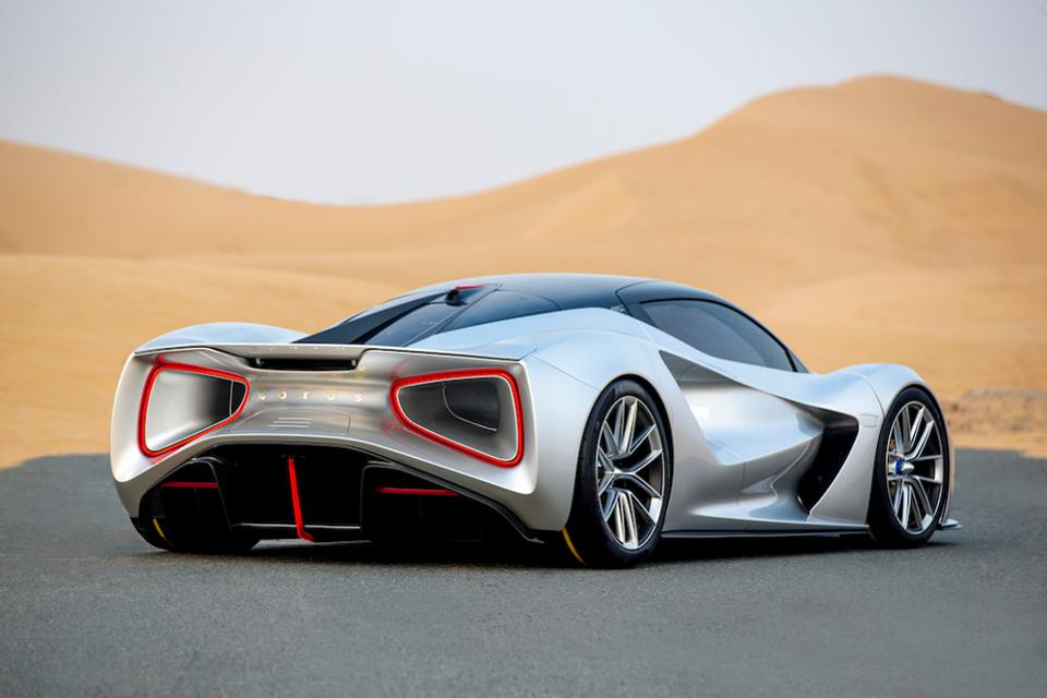
A luxury hypercar.
Is it now. Let’s see if it looks the part.

uhm. Maybe not.
(ignore the badly stamped wiper, it was being temperamental)
So aside from the wheel arches not being filled (unsure whether this was a morph reset problem, but the track width on the SWB La Ferrari body is super high), that this front end is not the worst I have seen in this competition is unfortunately not saying much. It has some structure. It has some ideas, but it’s awfully clunky and fussy and lines going everywhere and nowhere. And the headlights, this is the second entry that has a single fixture that doesn’t actually fit the body so there’s awful bumps and ridges on it.

I can see what you were trying with those vents but unfortunately it’s nowhere near enough.

I’m going to be rude here, but it needs saying.
![]()
Yeah like this is not good.
![]() more retching
more retching
Okay let me try explaining this… maybe you were kind of shooting for an Evija effect:
(I don’t even like the look of the Evija to be frank, but it’s an example).
Your tail light array is all over the place. Such a complex shape in such a crude format which so poorly matches the layout of the indicator and reverse lights (for which you used a single fixture) is vertigo inducing. The overall shaping is not thought out. The fixture variants selected are nonsensical. The exhausts have no business coming out as they do. And that wing actually belongs in the 80s.
I have to stop there.
Aesthetics
Your colour selection didn’t help you but was the least of your problems
Impact
As I said before, and I’ll say again:

Construction
Coherence

No doubt this was an inspiration of surrealist animator Cyriak, but even Cyriak videos make more sense than this car did, so have the whackiest trip of them all.
Verdict
Need I say it?
kursk’s ![]() count: 1
count: 1
Sorry this was so late. Now that state borders are about to shut and all non-essential services are going to freeze, I went for a late night last minute shopping round for some “non-essentials”. If I’m gonna be locked up in this apartment despite the fact I still have to go out there and get COVID breathed on me every day at work, I’m gonna do it in style.
Also, if I do get banned for this post, I’ll keep writing the judgements while I sit out my penance ![]()
33 Likes
The self-destructing washing machine used to describe a car? God I wish I made a complete throwaway entry just to see what you’d come up with to insult it 
3 Likes
What I’m really salty about is that 15 people have now watched a giant yiff ball and an apocalyptic wave of spooge and nobody has called me out on it…
4 Likes
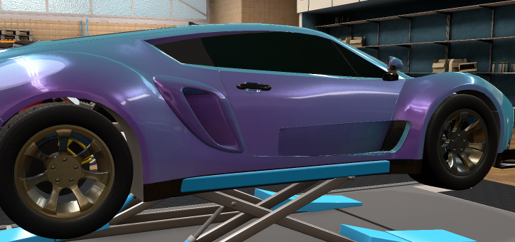
Honestly, I just wanted to shove that… Thing, out of my system. Too much time sunk into it, not feeling very satisfied. And I really don’t like to scrap and start over.
The headlights… Alright, you try placing headlights on that body and not clip the tires.
The rear… I just wanted to try something. No real basis. I will happily take that , not because I’m proud of that thing (I mean, a twin-turbo boxer 6 hypercar), but because I’m just happy it’s done and over with.
Note: You didn’t mention the rear windshield.
Other Note: I personally liked the front vents. Regardless, I would have binned this myself.
Yeah, it’s called using a different fixture.
Most headlights on modern hypercars are not a single fixture. They can have very specific shapes so more advanced players tend to use composite to make up the headlight.
There is nothing of note here that would change my judgement. If I made a comment on every single fixture section I’d become an alcoholic before I finish.
Why wait?
2 Likes
Because given the definition of an alcoholic is “they drink more than the doctor does”, it’s actually very hard to become an alcoholic when you are the doctor.
2 Likes
Never doubt yourself man, you can do it 
7 Likes
 I got rightfully destroyed
2 Likes
Were the explanations at least vaguely helpful? Please tell me that it gave you some ideas about how you might make things work in future.
Judgement Round 1: The Walkaround Part 5
I forgot to title the previous part
16 entries down. 4 in. That’s more than I expected.
I had to take a break from the judging process as work is getting more complicated (I’m required to help our unit transform our Nursing Home outreach service into a Nursing Home COVID Response unit and when we cover 47 nursing homes and our nurses keep getting pinged for fevers that require screening and takes them out of work for 3 days at a time, it’s not that easy). But here we go again.
Pulsar Neutron Mystablue
Choice quote from @Lordred:
…
There was none. He was far too matter-of-fact.
Well, at any rate let’s get into the car.

This is actually pretty promising. The arrangement is on the simple side, yes, but it’s cool and tastefully done. The lineup of things isn’t entirely perfect but the ideas are pretty strong. If this was a competition about making the most out of minimal fixtures this would do pretty well. But by that same token since this is not that competition, a bit of cleaning up or judicious selection may have enhanced the idea further.
This said the vents over the wheel arches go the wrong way: you’d be hard pressed to find real-life examples where the strakes don’t go the other way because the way shown here would only increase drag and lift. That’s a minor detail but one that I frequently encountered.
This unfortunately is where things kind of started falling away. I’m entirely unconvinced by the front vent. It was placed to line up nicely with seams, but not much else. Same with the rear vent, for that matter.

The approach remains consistent, and it’s solid. But it’s also a bit piecemeal if you look at the fixtures on the bootlid. I mean,

It’s just not what you come to expect from a 2020 hypercar. The window doesn’t actually integrate with any of the bodywork, there’s no… real poetry about it.
Aesthetics
It’s like what may happen if you tried to turn the Automation “Sea of Information” scene into a car. Retro-rad, which is actually a compliment.
Impact
this is a fucking old reference and it takes a whole 2 minutes to show that Usopp made Perona think he was lugging around a 10 ton hammer when in fact the whole head was made of canvas and not much else.
Yeah look when I first saw it I thought it had great promise and was expecting to be blown away but eh it kind of faded…
Construction
Solid, to be honest, though extremely basic and not really of much note on the sides and top.
Coherence
Front and back is, again, rather solid.
Verdict
If Yang’s entry was the one that squeaked in, this is unfortunately the entry that squeaked out. There’s bits I genuinely like. But it’s just not of the construction level to be convincing enough as a hypercar.
I do like the paintjob though.
Lordred’s ![]() count: 0 (it’s not bad, it’s just not good enough)
count: 0 (it’s not bad, it’s just not good enough)
Reaper EOS
Choice quote from @crimsoneon:
figured I’d create a user and throw my favorite car to the wolves
-
Flattered that you’d create a user for this
-
But I’m not a wolf, uwu

Dahlink, could you fetch me the eyedrops? I snorted some Tabasco while doing my eyelashes and now the mascara is running everywhere aaaaaaaaaaaaaaa
Okay so basically that’s an errrr unique? arrangement of fixtures but it’s just… awkward because it’s really fussy detail (again, too many strakes in that vent!) and then big fat slabs of “blank”. And the headlights are extremely small and squinty (even accounting for the popups?) It kind of looks like someone tried to make a Miata NA out of a Murcielago which is kind of not what you’re aiming for. It’s the proportions, Munro! this is an in-joke, I’m not assuming your name is Munro

Eh it’s about normal I guess. This body doesn’t exactly give you much scope for doing wild things and keeping it period correct for modern, but I’m still underwhelmed.

This is like what happens when you try to get enough “riced up” stars to land some magazine slots in the starter class of Need for Speed Underground 2.
Aesthetics
Lambo meets lo-rent Fast & Furious. The first one.
Impact

Construction
At least nothing was egregiously out of place I guess
Coherence
If you make the car dark enough you can almost ignore the fixtures ![]()
Verdict
It’s hardly a “my first Automation car” but the saying goes an artist will draw a thousand bad pictures before they draw a good one…
So no it doesn’t pass.
CrimsonEon’s ![]() count: 0 (because it didn’t make me vomit like several of the other entries here)
count: 0 (because it didn’t make me vomit like several of the other entries here)
Haapala Saatanan Kokemus
Choice quote from @Mikonp7:
Hewwo big guy UwU
Pls except my humble suwubmiwwion


ngl, this is pretty wild. The execution is not the cleanest, but the idea kind of reminds me of if Toyota had gone full send and made the FT1 both hyper and in the style of the old FIA GT class, and if you like the sound of that then obviously that’s a good thing.

But what were you trying to do here? What is that side? And I can see where you’ve tried to mask the window but it’s also not very clean.

Those fins are poking out the back of the grilles which is a bit careless. Some intimations towards shape changing of the car on what is a very, well, 90s GT body, but didn’t fully commit so the rear fascia is a bit too low. The exhaust placement is a bit… well it’s alright, but I wonder if you shouldn’t have used something more angled instead of bent.

These are pointing the wrong way. You want the driver to do a Dumbreck?
Aesthetics

This is a part compliment. Intentional or not, this car seems to be full of feline motifs. But it’s also cobbled together with a hodge podge of conflicting features, hence you get the Michelle Pfeiffer version of Catwoman where she stitches her costume out of scraps and garbage bags. If you don’t look too closely it’s kinda rad.
Impact
Construction

Yeah it’s a bit of a car crash I’m afraid.
Coherence

Like me after 3 beers: I can remember everything but I’m slurring my speech and can’t really be bothered to make sense.
Verdict
The idea is very cool and would be great to see in action, but there are too many errors and carelessness in construction for it to ever look good in Beam. If it were tidied up and refined it could be a contender, so I won’t bin it, but in this field I can’t take it through either.
Mikonp’s ![]() count: 0
count: 0
Zephorus Project AA
Choice quote from @Sky-High:
I’m gonna get screwed over by a few things probably
Such as not wanting to spend more than 4 hours thinking about any one car? Or perhaps the penchant for making the car look better than it is using photomode ![]()
![]()
Get ready!

This is clearly not the car that you posted in the thread, as you had forewarned.
This is a very interesting fascia. Sleek, aggressive but also restrained. I can see why you wanted to do electric hyper. The construction is quite simple, but I am not actually complaining.
Ok do you see what the problem is here?
I too am very fond of the deep cutout in the side bodywork. Not many people attempted to go full modern and start doing Valkyrie kind of things.
But you can only go so far because you can’t easily model the underside of the car, plus the monocoque chassis peeks out from beneath. I spent many hours making workarounds before chickenbiscuit’s hyper mod (which you’ve used here), because it’s not a good look.

This edge here. That’s not very clean. This kind of uncleanliness is everywhere in many entries (so I’m not singling this one out).
Beam mods tend to be unkind to this kind of construction. I was hoping for more refined.

You really REALLY like this decal don’t you!

This is a cool idea. I like the general direction.
It’s just that if you leave the rear open it’s not flattering on Automation cars for reasons I explained earlier. So it makes the mod look really lo-rent.

Let us now turn our attention to the elephant in the room: this hideously disproportionate canopy.
I can see what you were trying to do. It was a daring idea. And using this:

For the front windshield, was daring. But why did you have to do it? You forcibly changed the proportions of the entire top side and turned it into a tent.
The kicker is that it would already look quite a bit better if you had used “cutaway” instead of “1-axis conform”. But it still wouldn’t have solved the issue of this ridiculously looking blank canopy. Plexiglass bubbles are definitely a thing some manufacturers consider but they’re not shaped like this and are finnicky to make look good.
Also the construction on the rear end is a bit messy too. Lots of edges that really shouldn’t be there, imo, and the gaps between fixtures are larger than the manufacturing defects in a British Leyland. Most players at this level take some care to clean up, you know!
Aesthetics
This car has fully rad cues like electric hypercar of the future like:

But then it went and put a fucking tent on top, so here you go:

Impact
ngl when I took a look I was electrified.

But then you went and put a tent on it so here you go:

Construction
along with the hype, comes

your build quality mate
Coherence
yeah it was actually solid so I’m not gonna roast you on this point
Verdict
This is far from the worst car. It really is. What I found galling was that if you did ever come around to take the due care to make the car look perfect when exported the excellent ideas that you do have could be realised with vibrancy.
As it is, yawning panel gaps, bits showing that shouldn’t, weird creases and edges where edges shouldn’t be all have curious parallels to the British Motor Manufacturing Industry which not surprisingly doesn’t exist anymore.
It isn’t exactly a bin, but I really can’t export this anywhere like it is now.
And also why did you put a fucking tent on it.
Riley’s ![]() count: 0
count: 0
Oh for real, nothing made it through this batch either?
It’s gotta pick up sometime, I hope.
28 Likes