I heard we are posting now?


13 Likes


With about a hair under 3h remaining, entries have been successfully received and processed from:
@Chickenbiscuit
@titleguy1
@Mikonp7
@Mythrin
@Sky-High
@Nicholander
@Xepy
@Tsundere-kun
@MasterDoggo
@SyberRacer
@yangx2
@racer126
@NiuYorqCiti
@B1ill4Har8din1
The countdown timer can be found here.
8 Likes


might as well toss something in.
(ps don’t worry, i threw in some exhausts afterwards)
WAIT FUCK THE MIRRORS
14 Likes
I guess how the bumper bars stamp is why people don’t normally do this but the window lines on the body look bad so I modified them. here’s a close look. It looks better than everything else on the car.

1 Like


If you have Imagus or another browser plugin of the sort, simply hover your cursor over the hyperlinked usernames and the spinny gif should load right up, otherwise, just click on them. I didn’t put them in the thread because they do slow down the browsing experience quite a bit.
Also a warning before you continue! This is very long. Total is about 2850 words of text, it’s about a 10 minute read if you read each and every blurb of every car.
Crowd Sourcing Competition, round 2
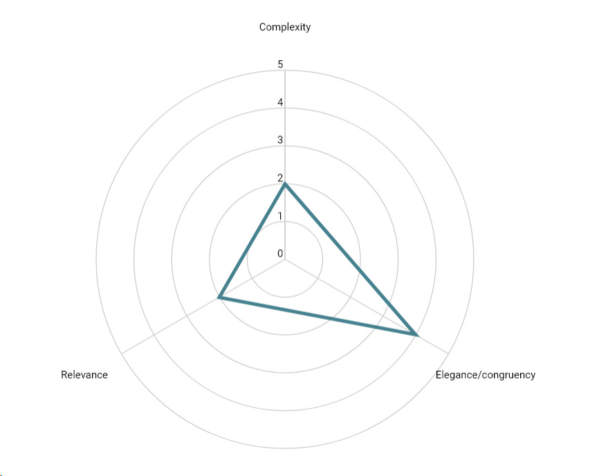
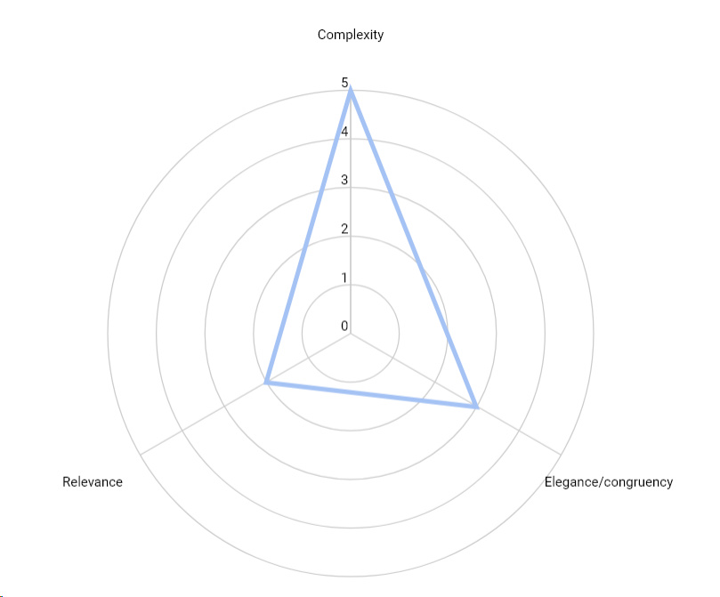
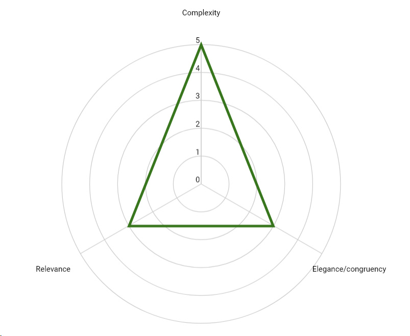
As time closes in for the reveal of the Aliga and the Geneva Motor Show approaches, 14 designers have presented their concept cars for what they think the Aliga should be. These will go on to be presented at the show, but in the meantime, they have been reviewed by the company. Considerations have been made with the main criteria of elegance/coherence, complexity and relevance in terms of modernity and also company design. This indicates that the ideal designs are those that are complex but beautiful and thoroughly modern.
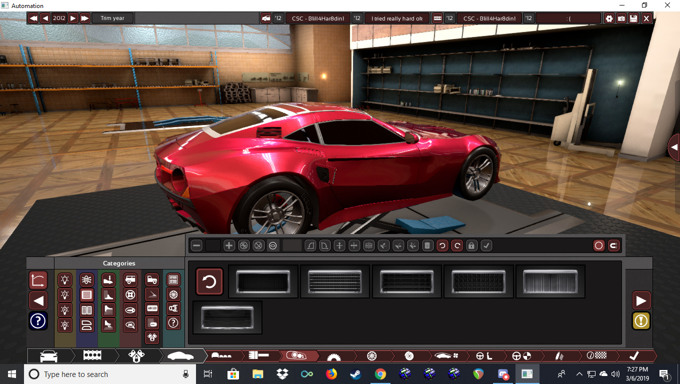
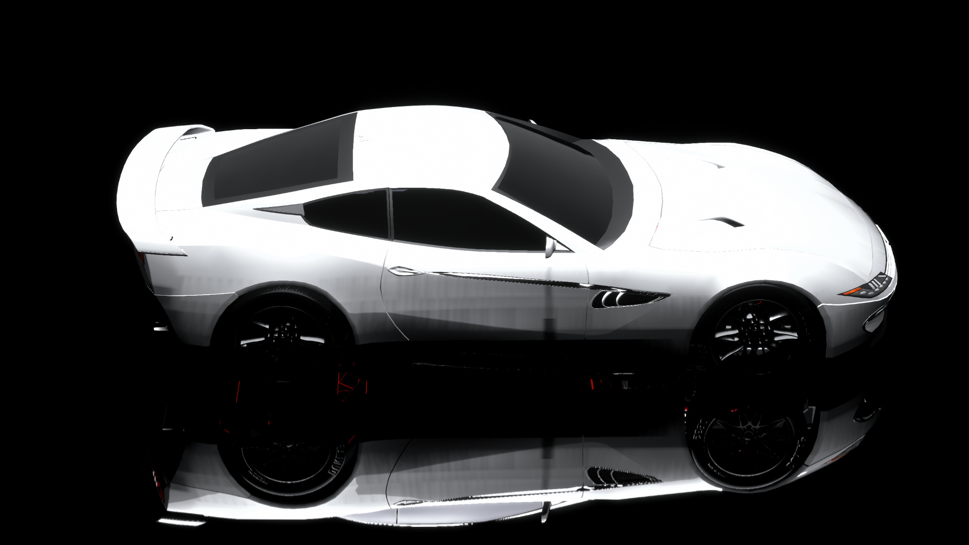
B1ill4Har8din1 @B1ill4Har8din1


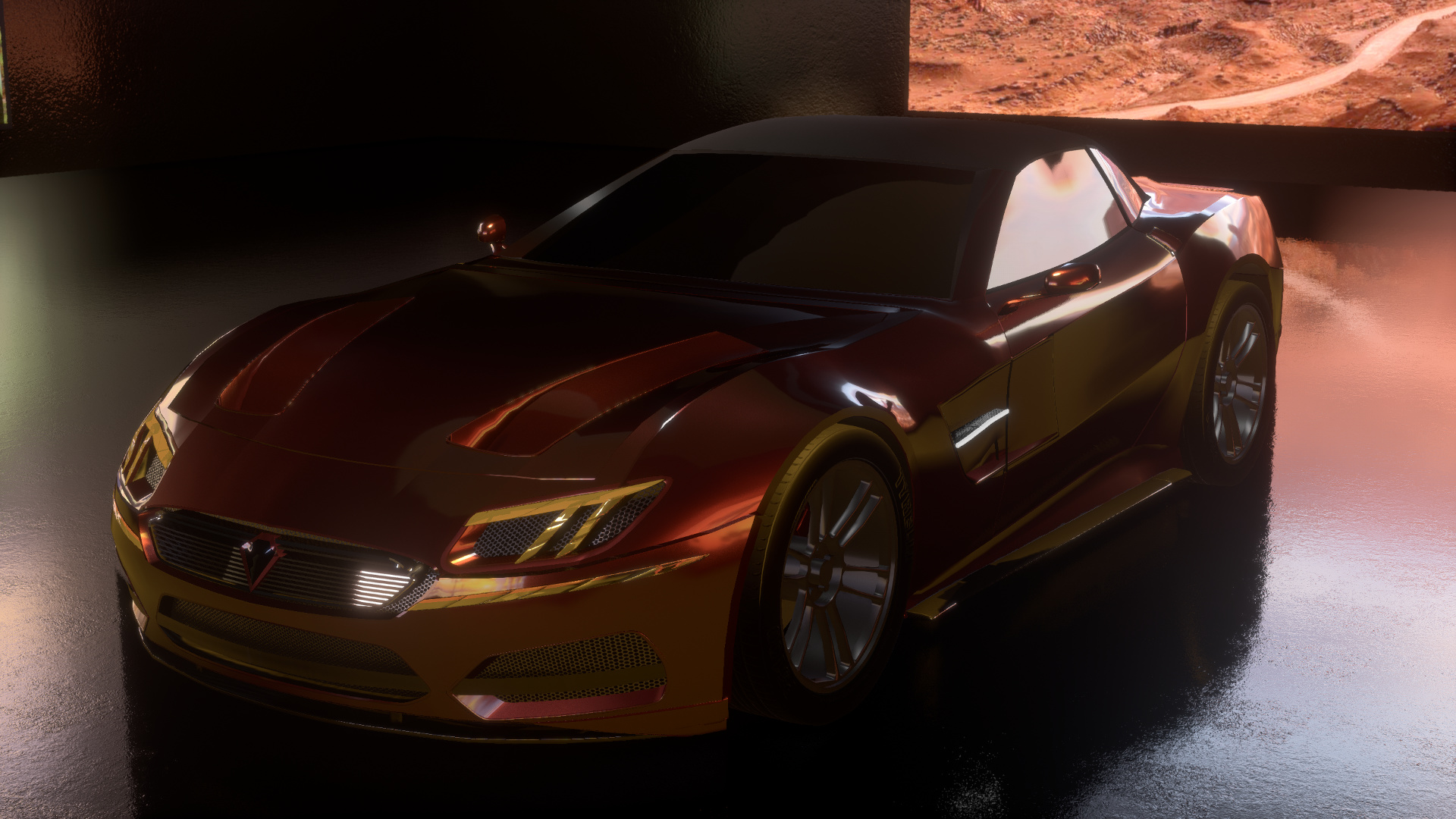
This was the first design examined. The overall body shape is acceptable, but the use of fixtures that detract from the flow of transitions across various sections of the car causes additional emphasis of dysfunctional elements, such as for instance, giving the rear section of the car a very heavy look, as if it is drooping and hanging off the car. All lights are completely anachronistic and unfitting. Furthermore, the sparse, simple and outdated front fascia does not pair well with the complex rear. Quite a few fixtures simply seem to be inserted to take up space or as afterthoughts, such as the triangular rear indicators by the lights, or the puzzling black vent by the doors, or the rectangular vent in the middle of the descending C-pillar.
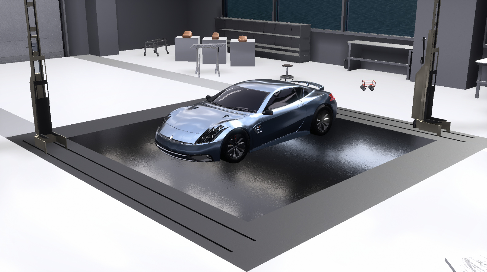
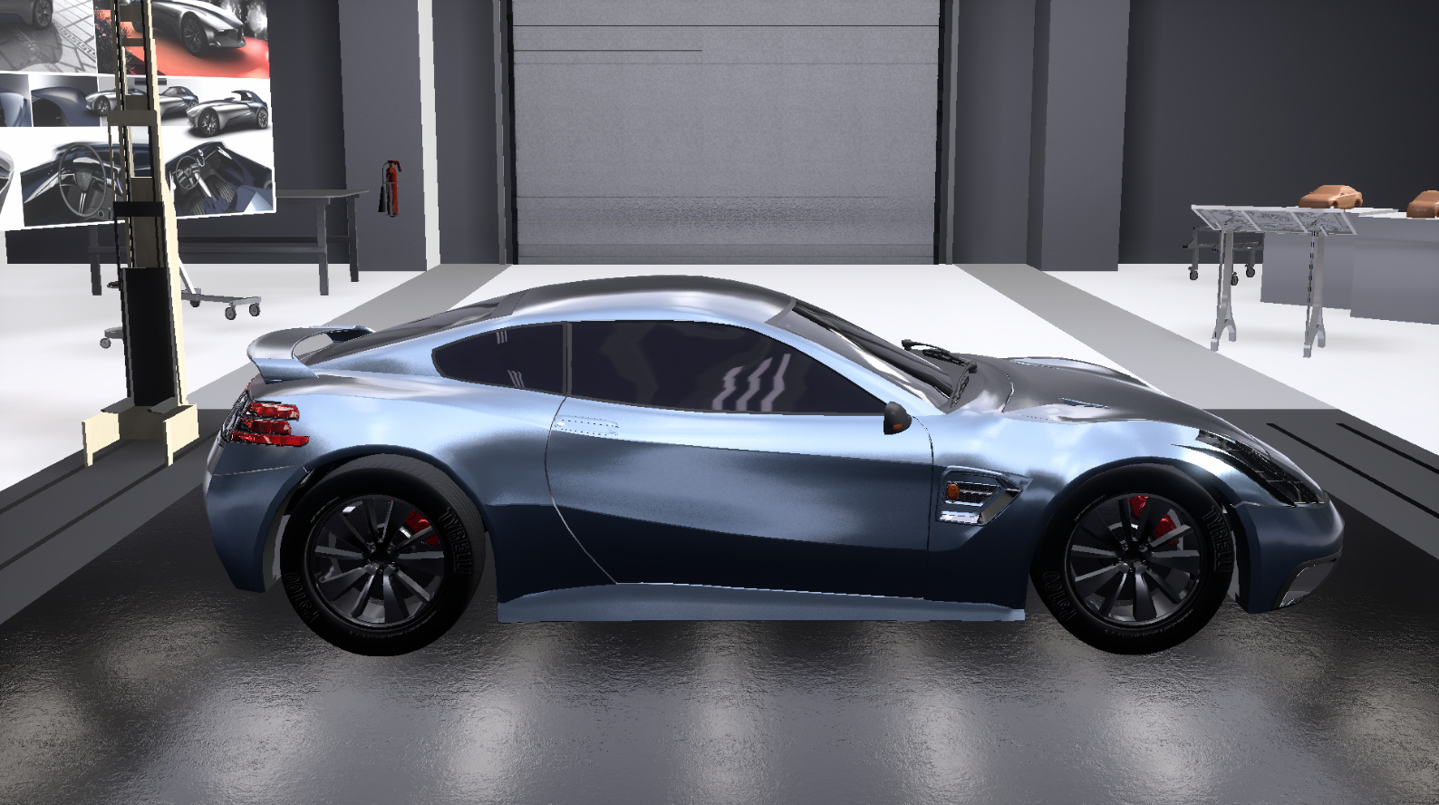
Chickenbiscuit @Chickenbiscuit


The following design was a starkly different car, surprising everyone. It has a front end with a full-width upper section, featuring the three-stripe motif as a DRL on the lights, while the lower portion has one central large grille flanked by two deep vents. We were not enamoured by the choice of having a horizontal slot like design on the grille, but agreed that it breaks monotony to some extent, however, we liked the simple choice of a modern looking lip. The clean, aggressive sinewy sculpting of the bonnet and sides of the car are very masterful and do not take away from the attitude of the car. The rear is approached with a high, squared off edge with a full-width taillight section sporting slim, elegant three-piece parallelogram-esque lights we very much liked. The indents underneath the lights were a bit confusing, however, and additionally, we felt that exhaust tips other than the standard circular ones would have worked a bit better. Nonetheless, we find that this design displays a high standard of modernity and complexity fused with a degree of elegance, without omitting the aggressive character - the sum of which comes out to a car that is very much desirable and in line with Cavallera design ideals.
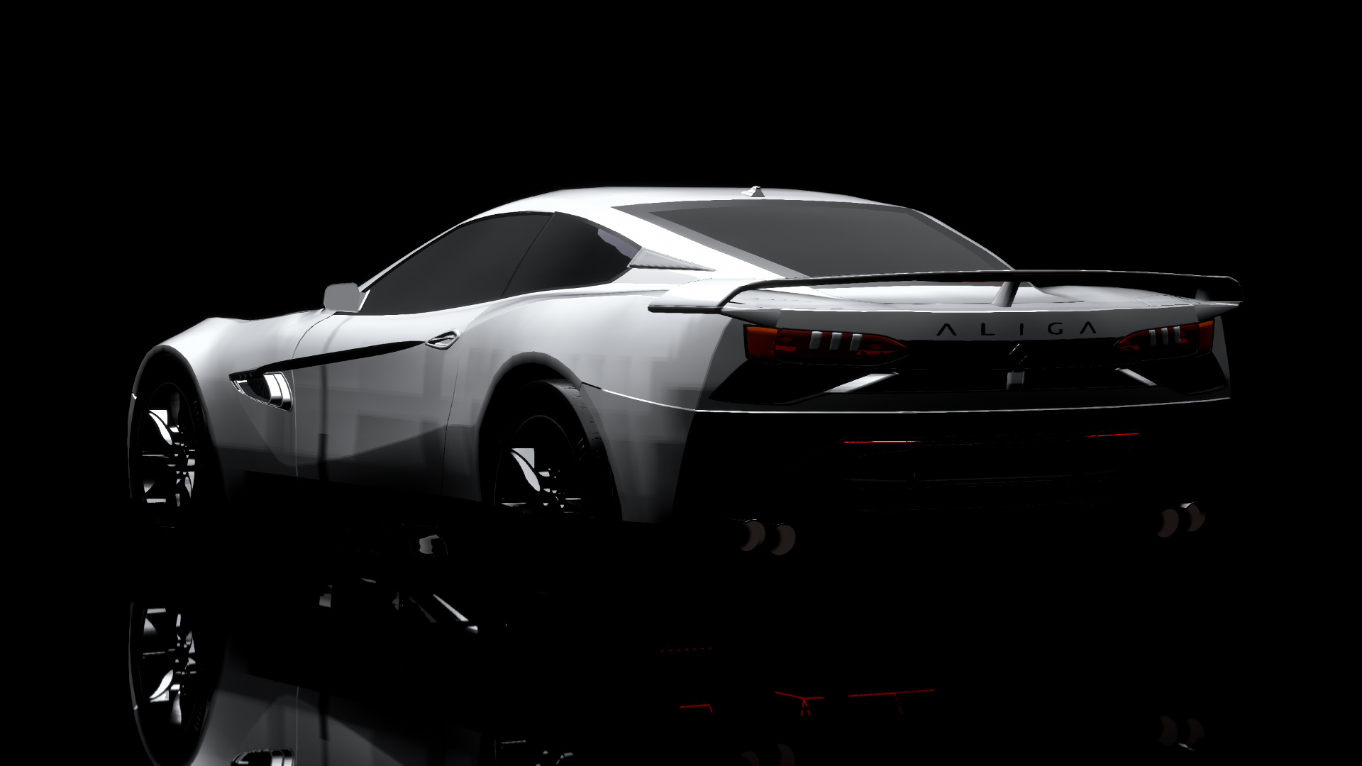
MasterDoggo @MasterDoggo

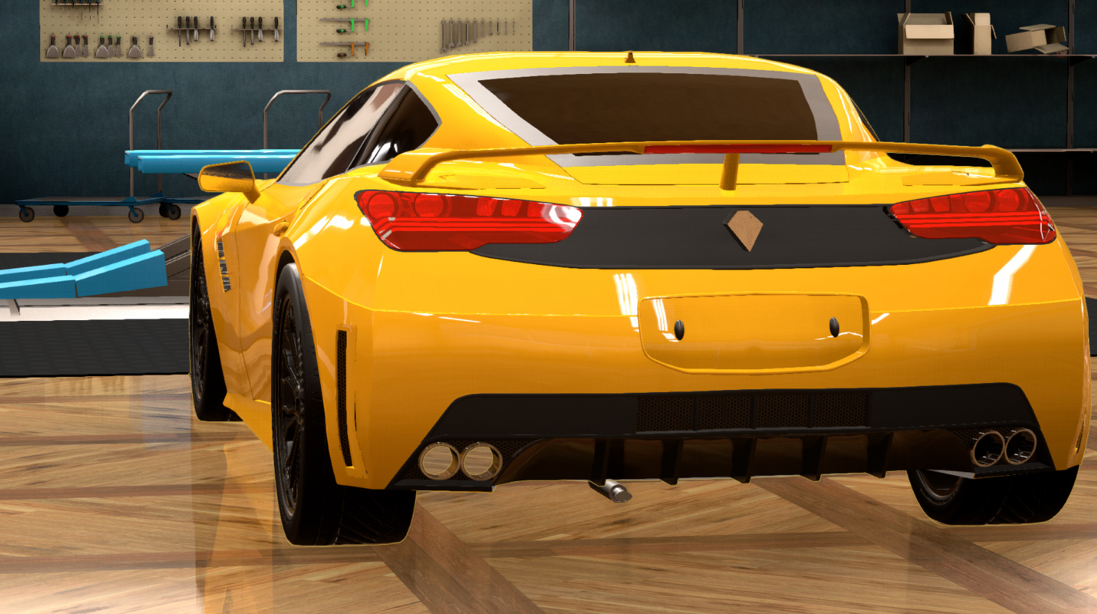


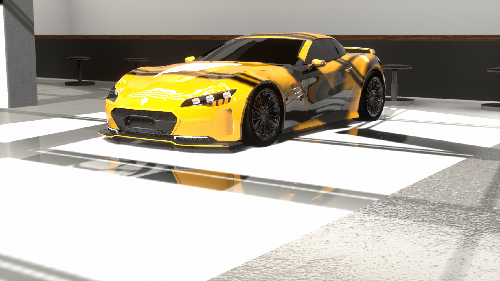
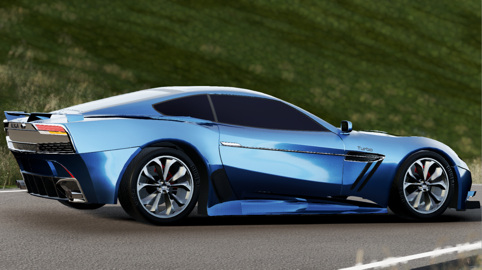
This design took a more classical approach to elegance, which is not inherently wrong, but does not allow it to align exactly with the style of this company, we felt it conformed more to beauty standards of French automakers in this decade of the early 2010s (furthered by the use of the yellow and black colour theme). On the whole, proportions and shapes were good albeit a little on the curvy side of elegant when looking at the greenhouse, rear upper central grille and exhaust tips. The grille inside the front central grille, the indent for the registration plate and the vents on the sides of the front and rear bumpers were the major issues we found with the design. The front lip with a body colour paint stripe was well received, while the side vents were seen more so as an idea with potential that was not executed in the best way. The taillights were a case of one step forward, one back - the integration of the three-stripe motif was liked but the presence of round bulbs behind them detracted from the look. To summarize: the emphasis on elegance via lack of complexity shifts the emphasis on to the proportions and lines of the car, which tend a little more towards curviness, we would have liked to see a little more edge. While we liked this car for what it is, it does not stack up very well by the criteria of good design by Cavallera, which is a shame.
OOC: I don’t know if it’s just me or what but I just can’t shake the connection
Mikonp7 @Mikonp7


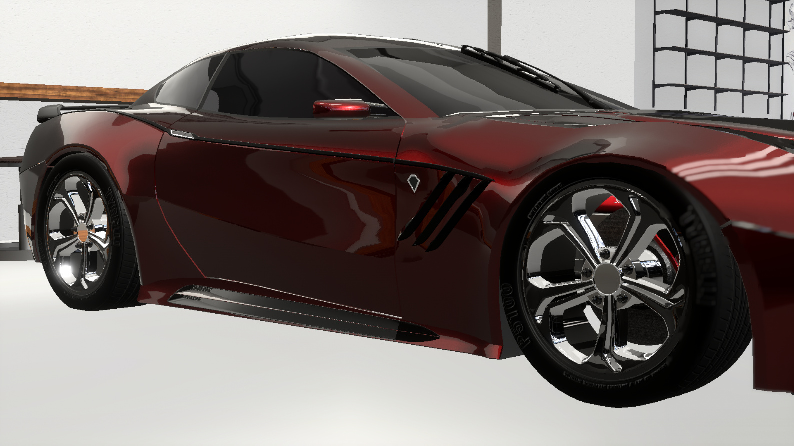
This is a design that attempts to be classy and does successfully do so at first glance, with it’s lower fixture count, richer dark colour. However, on closer examination, the design begins to fall apart. Firstly, the shape of the greenhouse is problematic. Secondly, the rear is not very coherent, as the upper section curves while the transition to the descent occurs at a sharp edge/angle, the deep plate indent comes out of nowhere. The taillights omit use of the three-stripe motif altogether, and the badge is oversized, and it appears that the rear bumper is riveted on to the rest of the car. Suddenly, at the bottom, there is a horizontal span of drooping chrome and four circular exhaust tips. On the other hand, the front is a more successful affair, but yet again the only chrome element is the central grille. We cannot help but feel that this feels more like a warmed over late 2000’s car that has been refreshed, a feeling compounded by the choice of wheels and the lower fascia construction. The very wide light strip out of the grille underneath the lights are an interesting touch but we are unsure if they fall more on the side of uniqueness or creating a divide between upper and lower fascia. The mix of material choices of chrome and black plastic are leaving us with conflicted feelings, but in the end we maintain that this looks more like a 2000s grand tourer that has been modernized and received vents on the bonnet to make a passing allusion to its sporty nature.
Mythrin @Mythrin


We found this design to be acceptable in terms of modernity but lacking in proportionality, with the front being rather compressed. The location, sizing and composition of the headlights was rather strange, especially seeing how wide the lower fascia was. On the whole, the front fascia was a mess of grilles and grille textures and an abnormally small lip. Side exit exhausts were a bit strange, as they have never been a design feature used by Cavallera at any point in time. Rather oddly, the door handles create lines that flow to the rear of the car, and we feel that they significantly hamper the natural flow of the body lines as well as distract by adding more shapes. The rear is characterized by this: a lot of shapes. There seems to have been some effort to have all the fixtures connect to each other, but this really creates an overwhelming amount of lines. The rear wing is also oddly small. A nice touch was the black section leading away from the end of the windows to the rear panel.
Nicholander @Nicholander


This design was simply an anomaly. No sense of coherence, not really like any car you would see on the road, not fitting automotive design in any period of time and definitely not conforming to company ideals. Also, full-width taillights have never been a styling feature of the Aliga.
NiuYorqCiti @NiuYorqCiti


This was a very confusing design. There were stand out, blinding elements of chrome such as the wheels, the large front vents, and the mirrors. It really feels like this car loses a sense of proportionality; the large vents dominate the front fascia while the headlights are far too intricate and too close together. The middle section of the lip lifting up combined with the lines of the vents implies a trapezoidal shape, which then with the headlights gives the car the face of a shocked person. The rear similarly had a rather odd design with taillights that didn’t seem to conform to the three-stripe motif, nor use a unique shape; them curving away at the corners right near the hard crease of the body does not look pleasant. The lower section of the rear also looks very generic. There is a vast expanse of empty space here, which is rudely interrupted by a brusque rectangle of a plate holder indent - however, this empty space does appear to be the trend for this car overall.
racer126 @racer126


This is a tricky car to decipher. We liked the idea of what was done on the sides of the car. It does feel to us like a lot more Asian design, with a lot more emphasis being placed on the sharp side of rounded. The design is also suspended in some sort of limbo between truly new and refreshed old. This design is simply not elegant enough, but furthermore it does not truly fit European nor Cavallera design. It seems to us more like a 2000s Asian production racecar modernized.
Sky-High @Sky-High


This design struggled to articulate anything. Firstly, there is the lack of depth, but more importantly, there is a lack of anything happening at all. Every element is parallel to the other. With the fixtures of the front spanning the entire width of the car all while being parallel and very low down, it stunts the look of the car. The car simply feels like it was put together with remnant parts such as simplistic strip lights, generic wings, generic quad tip exhausts, etc. It simply does not look real, nor does it convey or invoke much.
TheTechnoVampire @SyberRacer


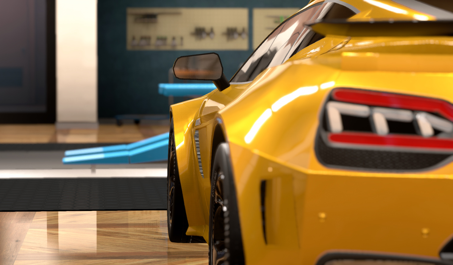


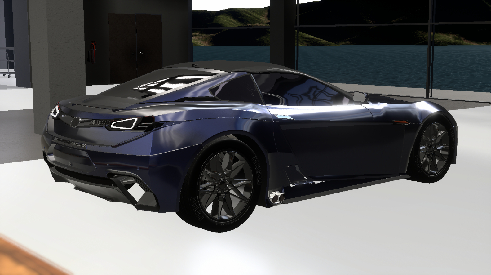
The front end was a great success with our designers. The relative success of making it appear as if the lower fascia is all one unit that has a complex shape with varying depth, and integrating aerodynamic function while retaining good proportions is very much admired. The headlight composition is excellent, and although we like the idea of having them be encased in a vent, we did not find the choice of fixture here to be exactly right. The sides of the car are a bit unremarkable, we would have liked to see the designers take some risk here. However, coming around to the rear, we absolutely loved the shape of the wing the designers used. The way the lines of the greenhouse sweep back to end perfectly at the base of the wing completes the coupe silhouette very well. Unfortunately, the rest of the rear failed to deliver. The same principle of the headlights are used, however, due to the fact that they rest on a flat surface, it means that the space in between them cannot be ignored, and further, we did not find the composition nor encasing to be spot on here. Another minor gripe is the quad circular tip. On the whole, however, this car does not lose all sense of proportion. Finally, one strange aspect we could not understand was the two rectangular scoops that run the length of the car’s bonnet and roof. At first, we thought that it might be an angular take on a double bubble roof but that does not quite seem to be so.
Titleguy1 @titleguy1


This design was a highly advanced and very complex design. The front fascia takes a similar approach as the previous design, at least if we look at the larger shapes, but we cannot say that we approve of all the choices on a finer level. For one, the shape of the headlights could have been more angular, and secondly, the vents of the lower fascia are very distracting. On that note, the front aero is not really integrated but more the central focus, and it appears to be the case for the design as a whole, which we are fine with - in fact, we very much enjoyed the split wing design at the rear - and we like that it emphasizes the racing focus of the car. The side is well composed, with the deep vent along the side of the car and the main side “gill”, however, the choice of door handle is not optimal. The rear takes an extremely polygonal, razor-like approach, which we feel neglects the sense of elegance of the car. Amusingly, the choice of exhaust tips are again circular, although centred and only dual tip this time. To summarize this design, it is extremely complex, very intricate and shows off the more race-y side of the car but this at the price of elegance.
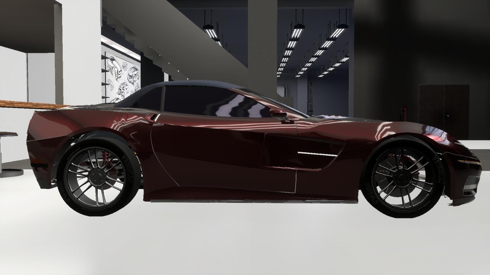
Tsundere-kun @Tsundere-kun


The most clearly evident difference of this car is the side profile. It has a very angled, flat tail. At first glance, it feels as it takes a similar racecar-ish approach but we would not agree. The construction of the sides are very nice, with the exception of the lone black plastic vent which is a significant detriment, as that concave section has a crease at the upper side, leading it very nicely to the rear which, also very nicely, features a wide, large blackened out section. Unfortunately, the rear succumbs to the mindset of the need to fill up every square centimetre of space with fixtures - especially with the downside of the lower rear section using shapes that clearly clash with the rest of the car - which is ironic considering that the taillights are too small. We also did not feel inspired by the choice of wing, nor the vents that run the length of the upper rear quarters. The front, size-wise was alright, but seriously overstyling with far too many overlapping lines completely destroying the sense of depth. The very complex lower fascia distracts from the simple and rather elegant shape of the headlights that also play on the idea of using depth well - however, we did not like two things - the omission of the three-stripe motif, and the vent underneath that goes down to the bonnet panel gap which has triangular indicators wedged in. This car had potential but was lost in tendencies of overstyling.
Xepy @Xepy


This design clearly hails from more Mediterranean influence. While we cannot say that we would exactly use these curved headlights, the idea behind them is a good one, especially with it’s unique integration of the three-stripe motif. This design somehow manages to lean on the more elegant side, maintaining relatively similar amounts of empty space between the front and rear. The rear, however, is more complex. We were not fans of the twin circular exhaust tips, but the full-width section for the rear to house the taillights, badging etc was perfect. The integration of the wing is rather interesting, with vents and black elements leading up to them, but we find that this gels better with the more elegant side of the car. The sides were also very well done, we liked the “gills” but we are not convinced on the line carrying through all the way to the rear. The only other complaint we had with the car was the central divider that was the wiper and roof length strip, those were unnecessary. Nonetheless, this car is a fresh breath of air, taking a more modern, sophisticated approach through elegance that we enjoy in it’s own way.
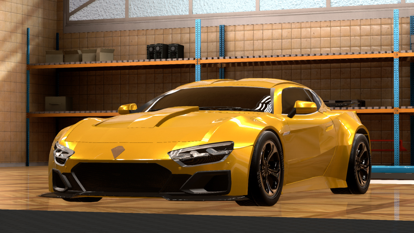
yangx2 @yangx2

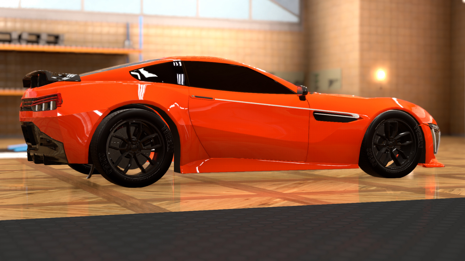


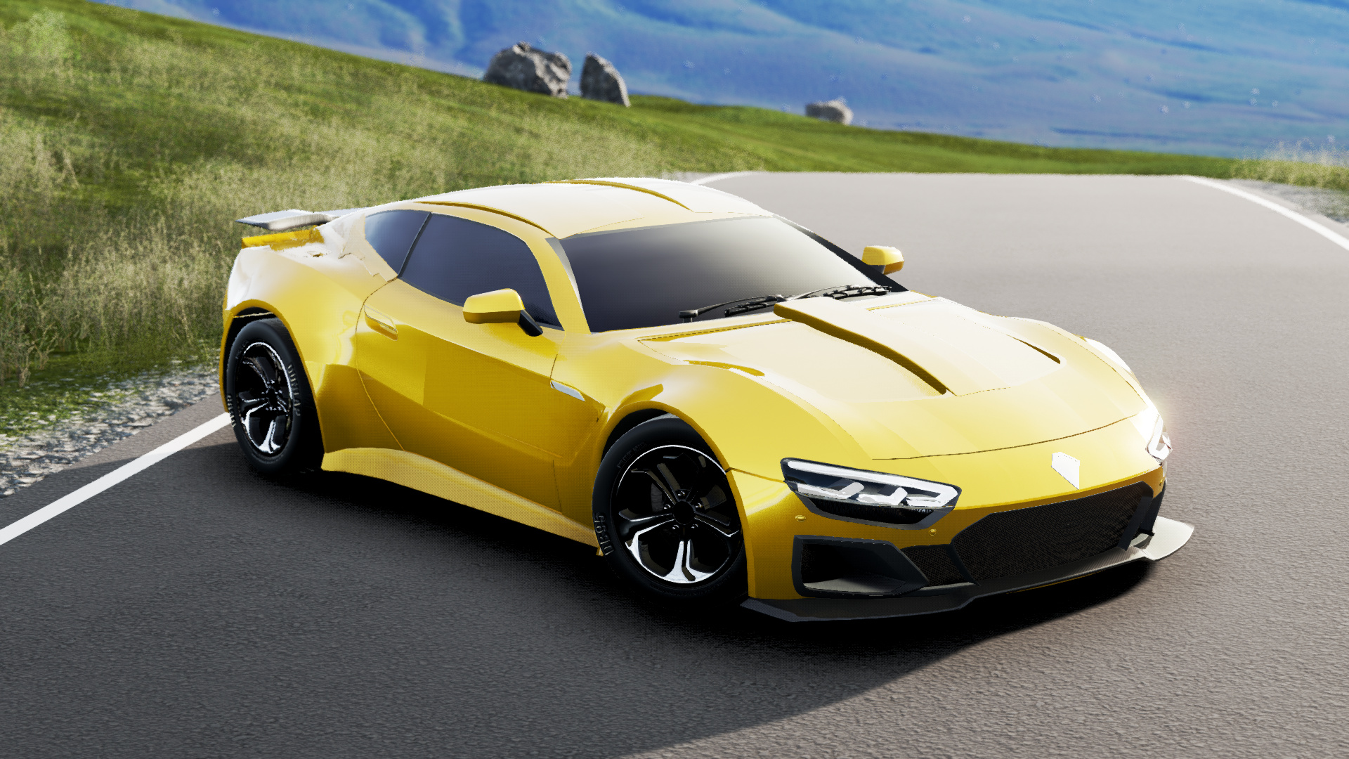
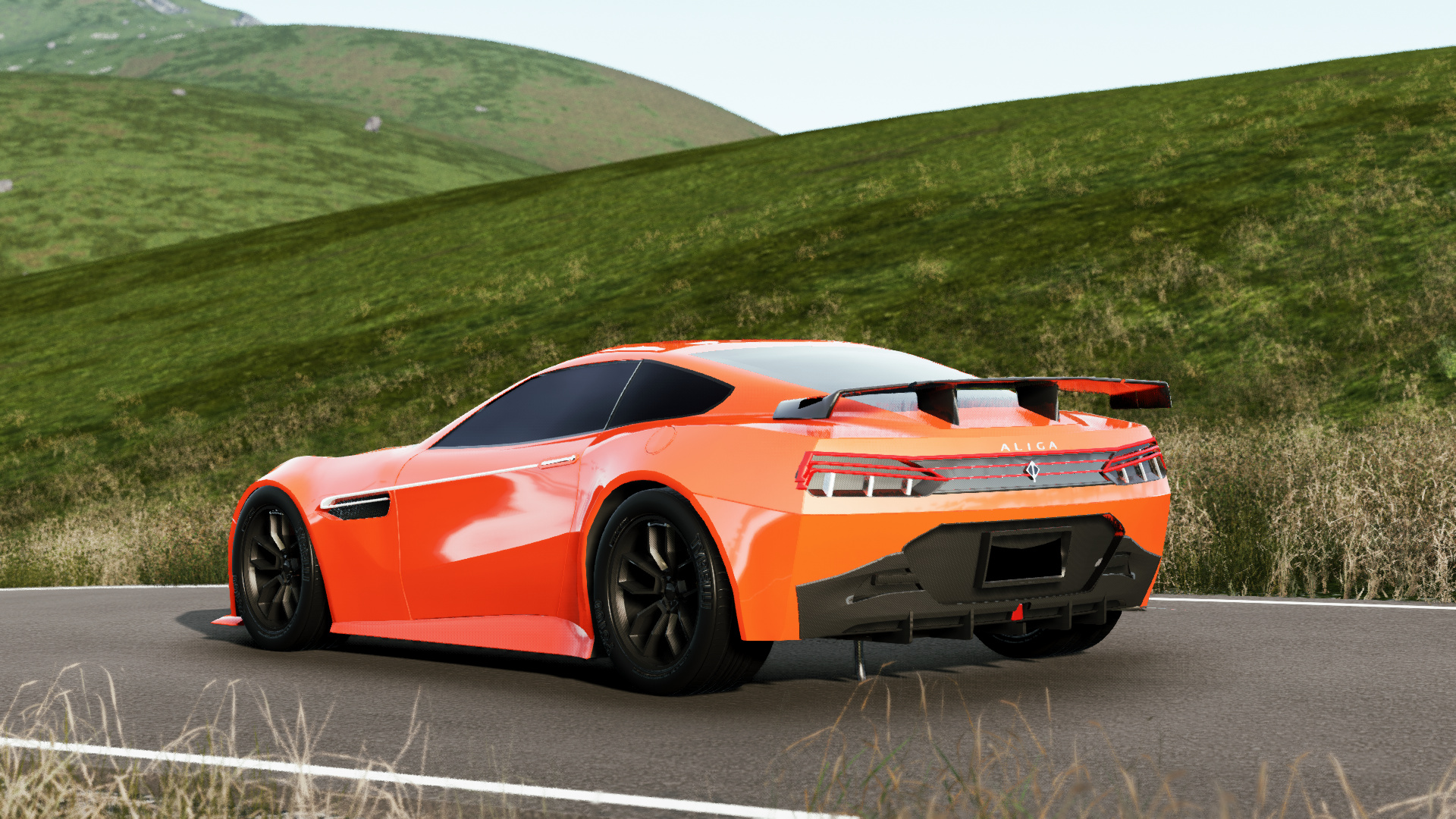
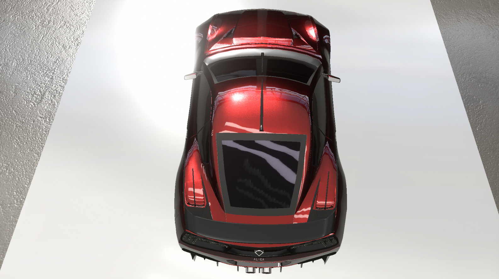
Finally, a bright orange car. This is a thoroughly modern car, but it does take the complexity up to a very high degree without using many elements. We found this design very interesting, beginning at the front. The central grille is the appropriate hexagonal shape while featuring the inner rounded rectangle that reminded us of the Moia to a great extent. At the same time, the three descending stripes were ultramodern, and well liked (but we are also in agreement that this should probably remain concept car material for the time being). This entire section is contained in one large unit, at the front. The sides are phenomenally clever in this car, with a simple but elegant backwards flicking stroke starting at the vent and ending at a slim door handle. Finally, the rear is separated, appropriately so, into a full-width upper section and an aggressively styled lower area. The taillights do utilise the three-stripe motif but we are not entirely convinced we like it. The same sentiment applies to the choice of wing. The lower section is an aggressive carving out of the body to house a large diffuser area, a large central hexagonal grille and one square red reflector/fog light/race style third brake light. Finally, to complete it there is one large, central hexagonal exhaust. In conclusion, there are a lot of elements and risks taken in the design of the car that we like very much, and despite the overall cohesion of the car, it does lose a lot of elegance. The upper rear are could have been better.
Results in order of placement, higher is better
1st: @Chickenbiscuit
2nd: @SyberRacer
3rd (tie): @yangx2 and @Xepy
@titleguy1
tie @MasterDoggo and @Tsundere-kun
@Mikonp7
@Mythrin
@Sky-High
@racer126
@NiuYorqCiti
@B1ill4Har8din1
@Nicholander
Congratulations to Chickenbiscuit, our winner, and I thank everyone for their participation and enthusiasm.
24 Likes
Thank you for hosting @ramthecowy, very cool. There were a lot of nice designs this round  . I won’t be able to host anything anytime soon so its on to 2nd place.
5 Likes
So close! But, I’ll definitely take a 2nd any day.
Congrats on winning, @Chickenbiscuit. Thank you to @ramthecowy for hosting this round. I felt the rear of that body was quite difficult to think of how to design a rear with a bit more depth, as well as try a style of taillight that wrapped around onto the sides. And yes, the angular double-bubble roof is what I was going for, with the lines of the bonnet vents/centre bulge flowing into the roof.
As far as hosting is concerned, I am a bit swamped with Uni assignments right now, so will have to pass the torch onto 3rd place.
4 Likes
Thanks for hosting, Ram!
To be honest I threw my entry together last minute due to the time crunch I’m on, and I don’t think it’s gonna end until the summer. As much as I would have loved to host, workload says otherwise. I’ll have to pass this one down.
2 Likes
I knew 2 hours was too short to make my entry. Next round I stay aware of the thread 
Same case, got too much going on to host right now.
1 Like
Hmmm I can’t know right now but probably yes, but not until Sunday
3 Likes
If Doggo and Tsundere are unable to host, I wouldn’t mind going in again. I just would like some variety too 
3 Likes
not another procrastination contest again /s
(srsly if nobody wants to host then let’s vote)
or give it to me
