Results

Somewhere at the Deer And Hunt Megaplex. A group of well dressed men from multiple deparments walk into the big auditorium where all the cars were parked up next to each other, still giving enough space between them to easily circle around them.
@Sky-High Zephorus PU - 239


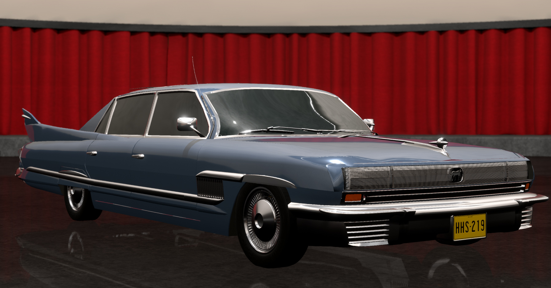
The big blue sedan sends out a masculine opulent aura. The many straight lines and heavy use of chrome really make this an eyecatcher. The front takes some insparation from early SuperCoupes with its hidden headlights, while the hood stripe is a throwback to the Goonie. The real winner here is the backside though. The exposed maschinery is good to showcase the new technology and the general styling flows great with the lines givin. Only the double fins are a bit of an eyebrow raiser.
@EnCR Avantii Atrocolt


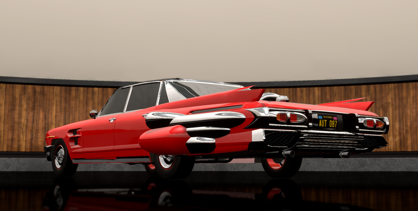
The next car in line looks like it came straight from the moon. The theme of this car is clearly to showcase the turbine part of the engine. Many elements like the midmounted front turbine and big airintakes on the side underline that. The giant glass roof is also a great feature which doesnt only look like it was taken out these old Jetsons Cartoons, but will also make the driving experience even better. Overall the car has a nice streamlined look to it. But to make this a street legal design those giant side elements would need a redesign. And while this also tries to showcase the new turbine engine in the back, it doesnt do as good of a job as the Zephorus.
@Maxbombe Pusilanime Magnanimous Aeroflow


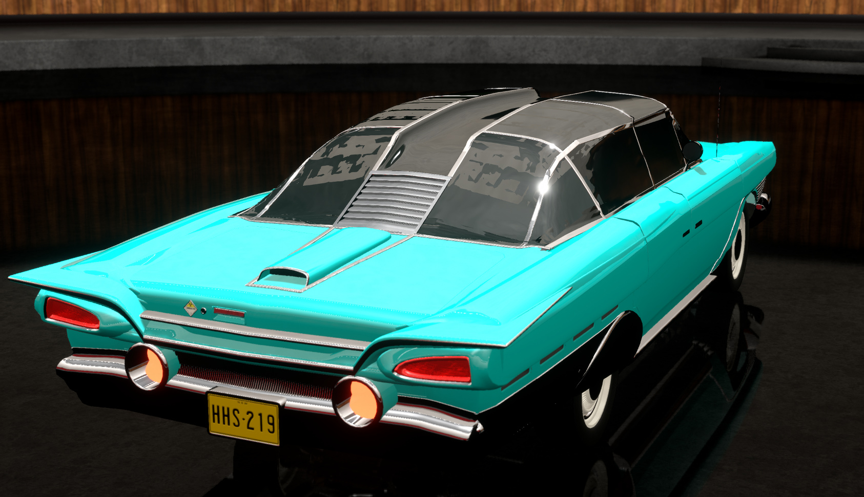
The next sedan came in a nice teal. This concept didnt went with massiv chrome bars, but rather used many thinner chrome lines which wrapped around the car. The front was a direct homage at the first Goonie with its two round lights and middle chrome stripe, even though that was maybe a bit large. The rear was less chrome heavy and features a lot of molded elements which makes the car really sleek and almost understated in some ways. The big bubbleroof is also a nice feature, even though the the dip in the middle is a bit extreme. The car also might need a warning that people should stay clear of the back for many feet if they dont want to get set on flames.
@HybridTronny Denver Atomic Cruiser


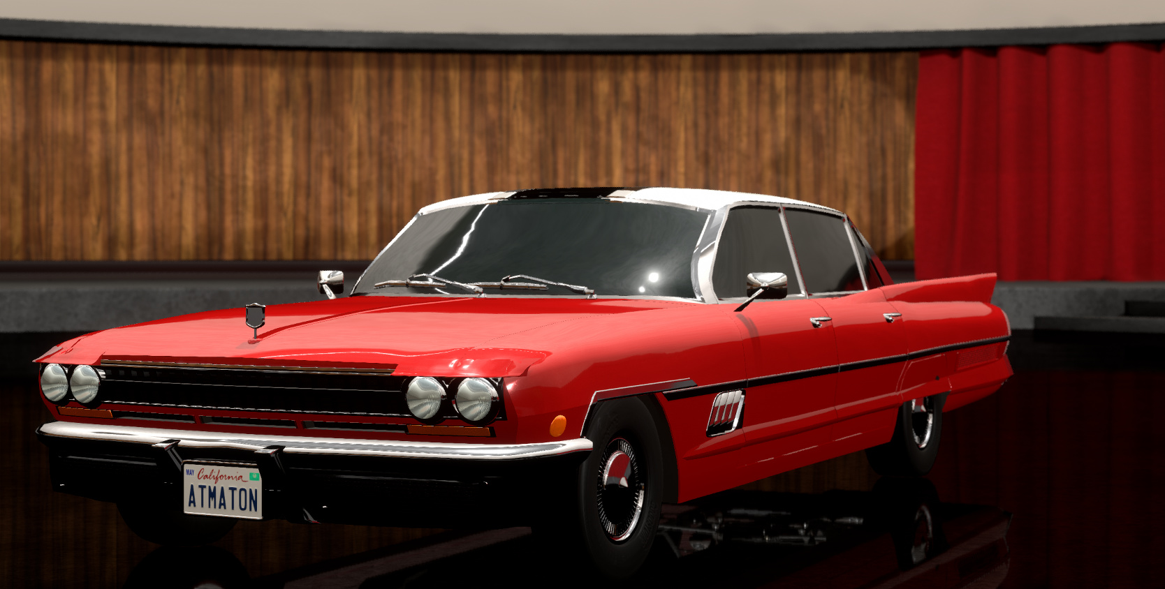
The car from Denver was next. The biggest problem of this car was that it was parked after the three other entries. It is certainly not a bad design, but it was just missing enough ompff to stand out. Many elements of this look nice, but where just bettter integrated in the other cars. The front is nice but doesnt really look like luxury. The elements on the trunk also look more glued on than having any active purpose. Overall the car is understated and doesnt really exceed in being futuristic.
@Fletchyboy100 Venturi Nereid Streamline


The last car in the lot was the most interresting. But more in the “Why is this here?”-Interresting way.
First of all this looks like a concept design from the 1970’s which is more than 50 years away by now. Then the name “Nereid”, yes that name was used, but it was giving by the original company Anhultz which provided the car for Deer And Hunt to modify for the american market. Speaking of, this is way too small for that. Its feels cramped insided considering the other cars and fitting the turbine engine into this would probally require to redesign the whole engine. The lighting stripes would also require many many lightbulbs to function. All in all, the team decided to push this back on the truck it came from and look at the other cars again.


