

10 Likes
— ENTRIES ARE NOW OPEN —
Deadline is here, good luck and have fun! Remember to take your time and not rush it.
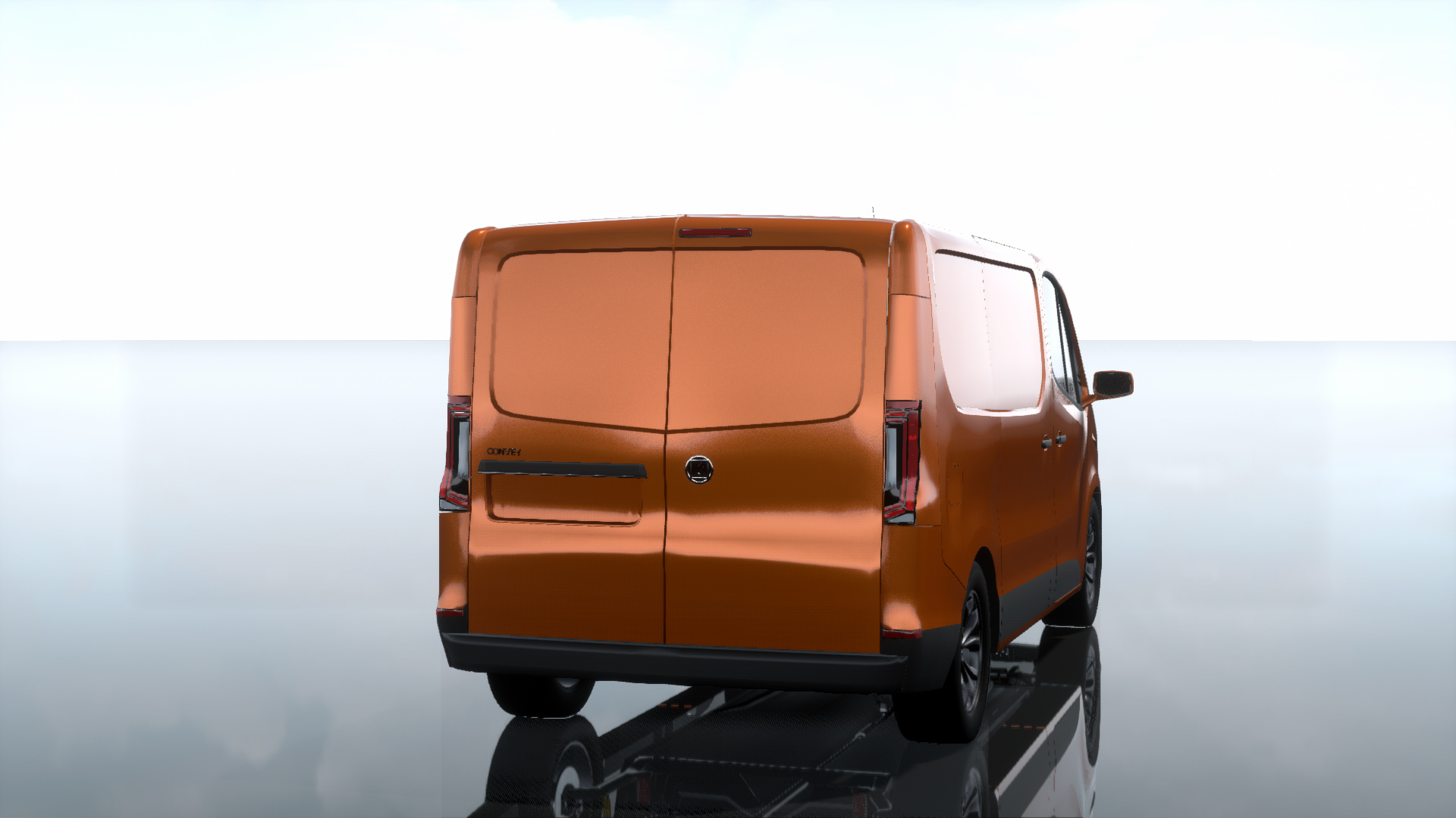
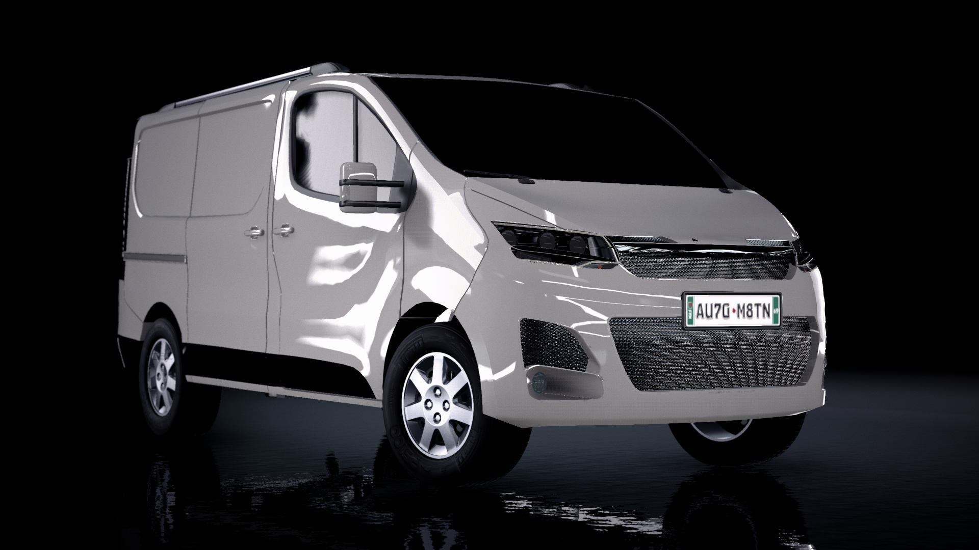
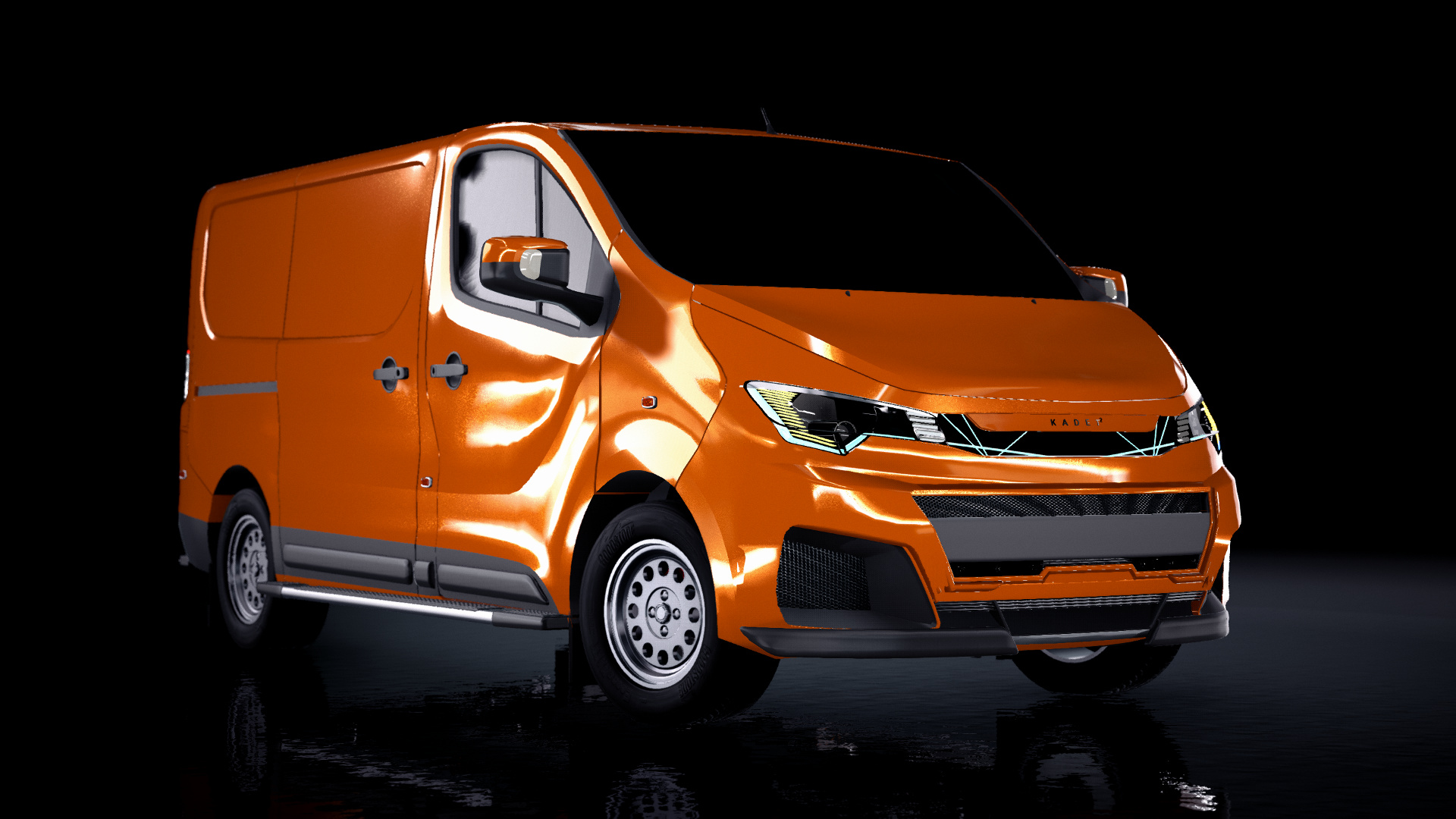
2020 Kadett Convey By Kaishen Design Corp.
  *may have to re-post this, it's messing upmy apologies about the photos everyone, something seems to be wrong that isn’t letting my photos show up. It seems to work on this post how ever.


2 Likes
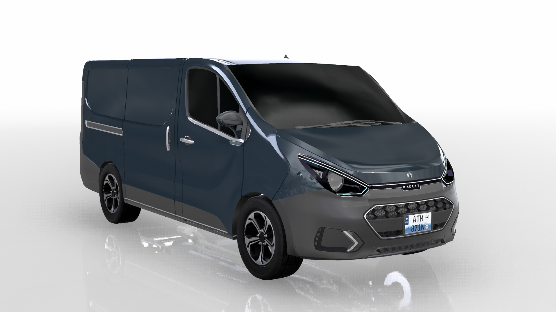
2020 KADETT CONVEY

BY PROJECT VALENTINE

"Gently and so graceful, something new is at hand.
'Style' is re-defined, as Neo-Romantique elegance."
Keiko Kimura
8 Likes


18 Likes


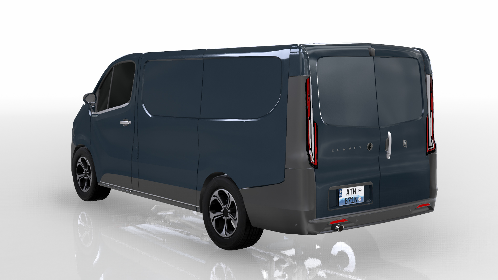


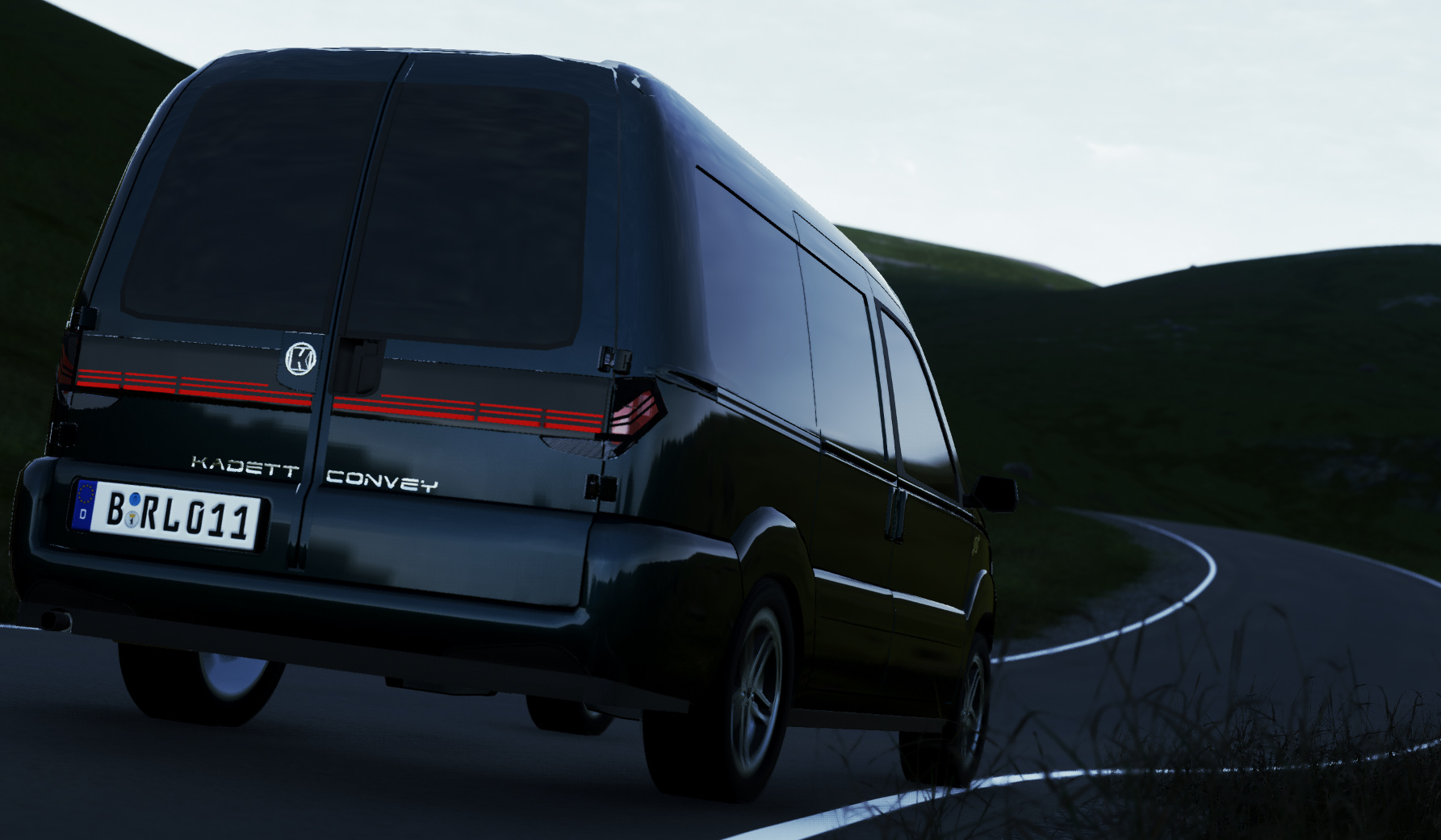


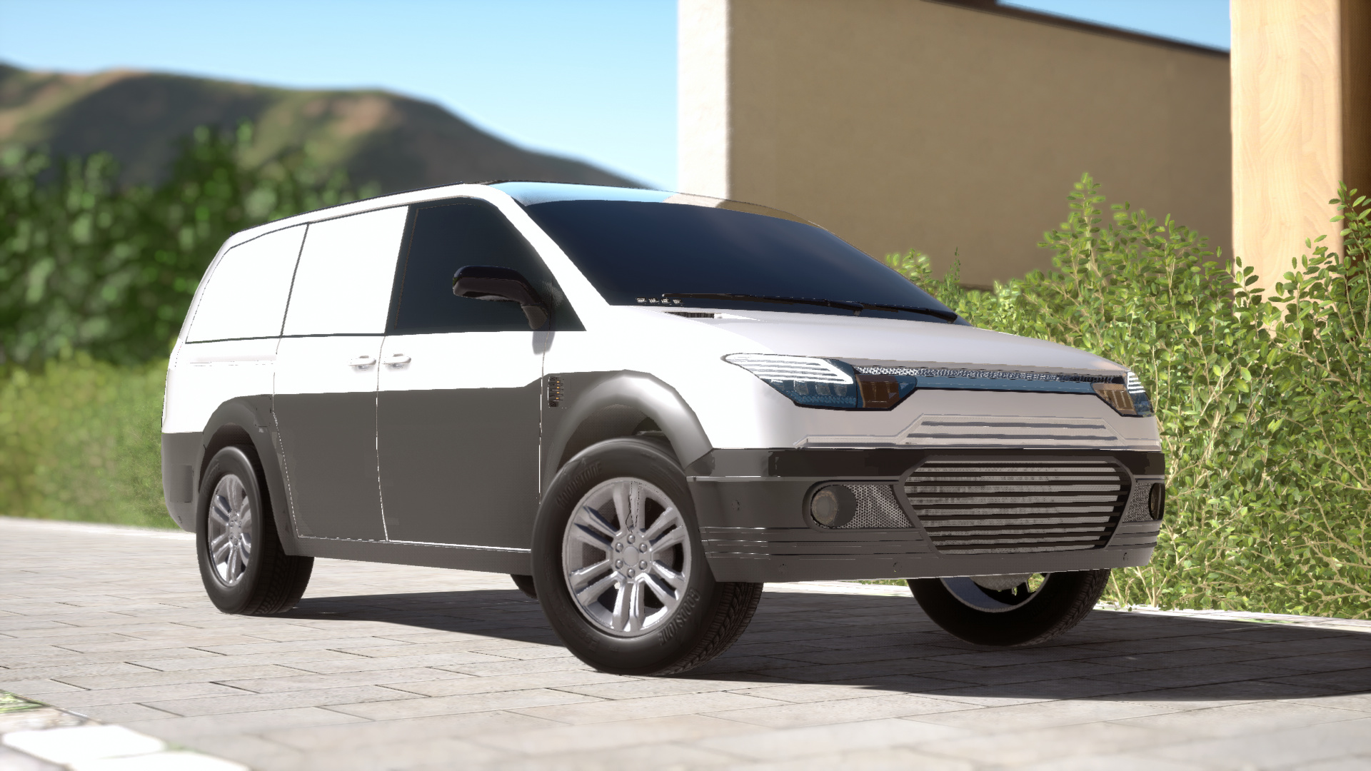
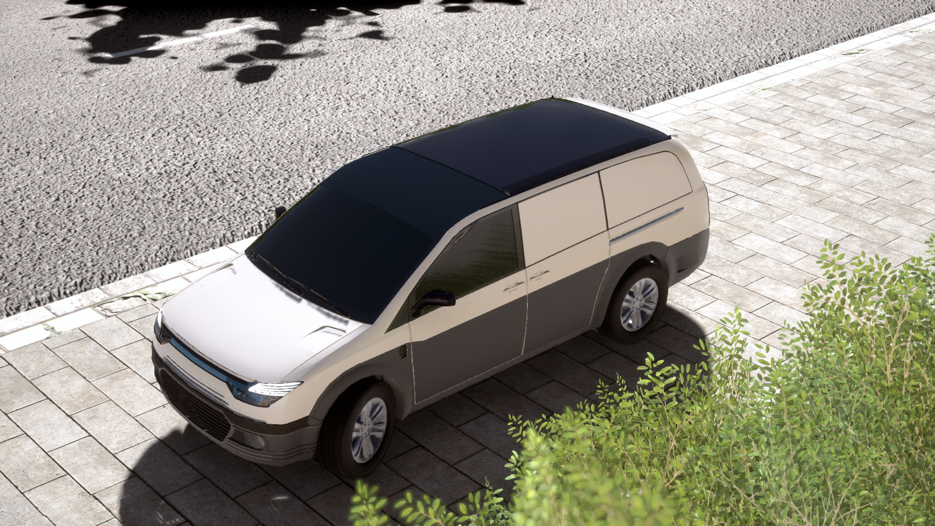
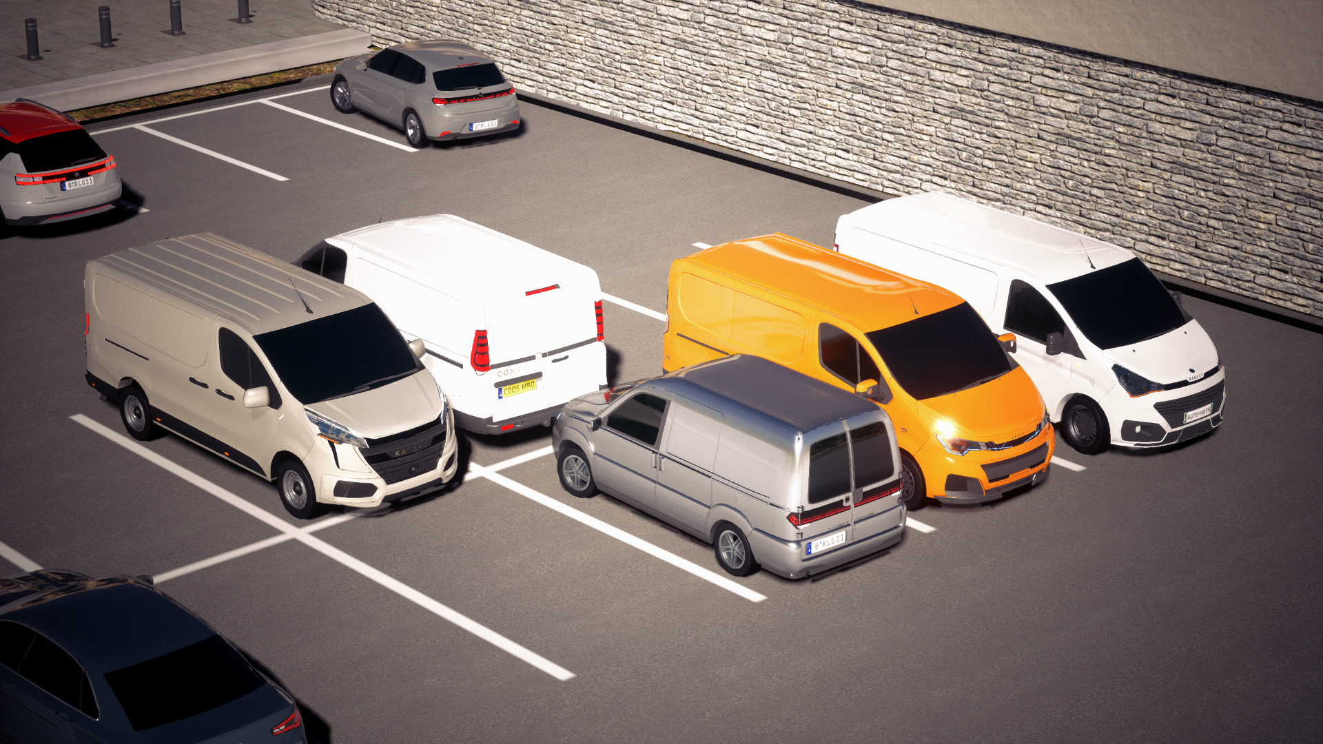
Kadett Convey by Marksman Design Shed


First CSC Experience...
Vehicle clearly a bit… tougher looking than it really should be, but that’s so bumper replacement costs are lower, and room to mount a Comet-Bar, and the Cameras placed in the grill, next to the Third Brakelight, and under the Mirrors should allow for a 360 Camera view on the Dashboard to help maneuver this thing.
12 Likes
— 24 HOURS REMAIN UNTIL DEADLINE —
As of now, I have received entries from
@Boiled_Steak
@Darkshade-AP_Autos
@HybridTronny
@Tzuyu_main
@Maxbombe
@Arn38fr
@Mikonp7
@mart1n2005
@F17Francesco
@vouge
@That-S-cop
@Slyo_vom_Pluto
has posted an ad but yet to send the .car file.
–
And now, an early apology. Due to unforeseen circumstances regarding real life, the reviews will have to be slightly delayed and might come in multiple parts. I hope you all understand.
10 Likes
HONGHU AUTOMOTIVE CORPORATION REPORT 004823-27SK
红湖设计报告004823-27SK
홍후 디자인 보고서 004823-27SK
Client: Kadett Motor Company
–
Model: Kadett Convey
–

Kadett Motor Company of Seoul, South Korea has commissioned the Honghu Automotive Corporation of Guangzhou, China to propose a redesign of the Convey utility van. After discussions with the Honghu, Huangdou and Jinhe design teams, the final concept was drafted on March 27, 2020.

The new design reflects Kadett’s traditional design language with elements from the Honghu Automotive Corporation, combining the utilitarian aesthetic with current Korean trends in design.

One draft design was proposed, it was inevitably chosen. I wasted 3 hours on this. This isn’t actually the Honghu Corp. Help.
15 Likes
/Kadett Convey/ by House of Letho

As you might expect, it looks minimalist at first, but you can always find new detail or two the closer you get.
3 Likes
You know immediately how successful your van is when it gets cut from the picture. Jokes aside, good lucky to all participants!
1 Like
— REVIEWS PART I —
Sponsored by better cars are harder to write about.
–
October 23rd, 2016.
Kadett CEO Cheo Ji-seok arrives early at his office and aaaaa nobody cares here are the reviews.
–

– @Boiled_Steak Aria Design –
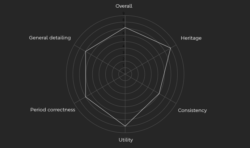
Choe Ji-seok: Looks to be a conventional van that is slightly pushing itself upmarket with LED lights and subtle chrome elements. It works.
Overall design: It’s definitely functional and the ideas present are good, however some elements could have been executed in a better way. The headlights are a good example, as placing them outward, more towards the sides of the van, would help the front end look more modern and generally nicer. The rear side window indents are a neat idea.
Heritage: This entry from Aria Design strays away from the usual Kadett styling theme while remaining in the basic idea of a black, faux upper grille and the actual grille placed below. Sadly, in the way it has been presented, the front end looks a little more outdated than it should. The angular vents follow the usual formula well.
Consistency: The front is run by horizontal lines and that theme continues nicely to the rear. The rear licence plate indent could have been designed using a more angular theme and the rear foglights could be considered too square.
Utility: It has a good amount of plastic for a panel van. Front headlights might be excessively overrun by LEDs however, but it’s nothing too important.
Period correctness: It looks plenty modern, thanks to LED headlights and slight splashes of chrome. Again however, spacing the headlights further apart would help with making it appear even more modern.
General detailing: It’s a shame the rear door railings weren’t mirrored and that the fuel filler flap would get blocked by the rear door if it were open. The sides would look cleaner and as a result, bettee, with the quick removal of the hood scoop used to style the rear bumper.

–
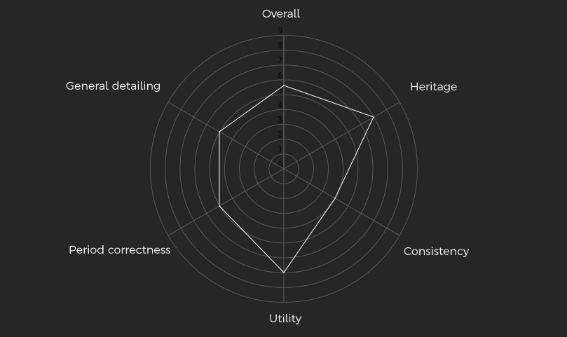
– @Darkshade-AP_Autos Kaishen Design Co. –
Choe Ji-seok: This one from Kaishen, frankly, doesn’t seem to find itself a footing. Perhaps a little rushed?
Overall design: It’s… decent. It isn’t trying to be anything that it isn’t and as such, it is just a van. That should generally be a good thing but in this instance, it feels a little underwhelming. Some additional experimentations would have been greatly appreciated. The front sidevents stand out in an unusual way.
Heritage: Just like the Aria submission, the Kaishen entry changes the original formula in a slight but definitely noticeably way - here, there are additional vents above the faux upper grille. Rear lights play around with different materials but this isn’t as noticeable as it perhaps should be.
Consistency: Very round front, very square rear: this van does not excel when it comes to consistency. There is also an abundance of ‘red’ at the rear, the removal of at least one of the lower red lights would easily fix that problem. The front licence plate is unusually high up.
Utility: The uses of chrome on the front grille and rear handle are odd and there seems to be a bit of a lock of plastic, but overall, the van seems fairly utilitarian and ready for the job. The use of a less shiny black colour for the sides and rear would help.
Period correctness: The front lights are nice and use LEDs tastefully. Playing around with more angular shapes for the inner lights could improve with making the front look more 2020. The hubcaps used are, no doubt, outdated and need updating.
General detailing: From both front to rear, the KADETT badging could have been spaced better, at least there was a nice attempt to create the Kadett badge in the rear. Bigger door handles would have been preferred.
–

– @HybridTronny Atera Design Studio –
Choe Ji-seok: There seems to be a good flow here overall while some parts do seem messy. It’s not bad.
Overall design: The general design has been adapted well to fit on a van, even if the front end seems to be too low down. Hood scoops have again been used and again, the design would benefit with the removal of them. The rear has been spaced well with the exception of the badging.
Heritage: It looks like a happier version of the Avatrek, so there’s no doubt it would fit in the Kadett lineup. Rear lights are perhaps a little reminiscent of the 2020 Beat while the front bumper has been very obviously inspired by the same car.
Consistency: Generally, the front and rear flow together well. One of the things that could be improved are the lower rear lights, which should be less boxy to fit with the upper lights.
Utility: There is plenty of plastic on this and could very well be the submission with the most amount of it. The small-seeming wheels also help with that, but the metallic front grille looks good and doesn’t overdo it. Door-handles would have to be increased in size however.
Period correctness: Thanks to the large front lights and relatively flat-looking rear lights, the Atera submission does not look as modern as it should. Having less of the bumper be plastic would also help, but the hubcaps are good.
General detailing: The door handles are different shades of plastic.

–

– @Maxbombe Spander Design –
Choe Ji-seok: Now this looks big and mean, I like it!
Overall design: Obviously inspired by the Beat, the entry from Spander Design looks intimidating and rather sporty for a van. Its stance stands out as the biggest van here and to make up for the resulting flat and empty sides, a thick indent line runs across the sides. It’s well intentioned, but ends up being a little too messy. Due to the rear licence plate indent being low down, the rear looks droopy.
Heritage: It looks like a fat Beat, and that’s not necessarily a bad thing. Grilles dominate the front bumper and the material choices for lighting match the brand well. Badging has been well done and does not look out of place.
Consistency: The front is characterized by sharp, daring angles and that does create a contrast with the rear, which is blocky and, in case of the licence plate indent and handle, round. Nothing feels mismatched however.
Utility: They’re good for looking sporty but the front grilles don’t help with it looking like a proper utility vehicle. Use of materials from front to rear is good but perhaps lacking in the amount of plastic.
Period correctness: The sharp angles of the front from earlier lend to it looking very modern but sadly, the rear can’t quite catch up. The amber indicators up front do also age the front some, but it does nothing notable.
General detailing: The window shaping, if a little messy, has been executed well and the same can be said about the side indent. What isn’t really messy is the side railing, which is excellent, and the front grilles, though the windshield wipers would benefit from being bigger.

–
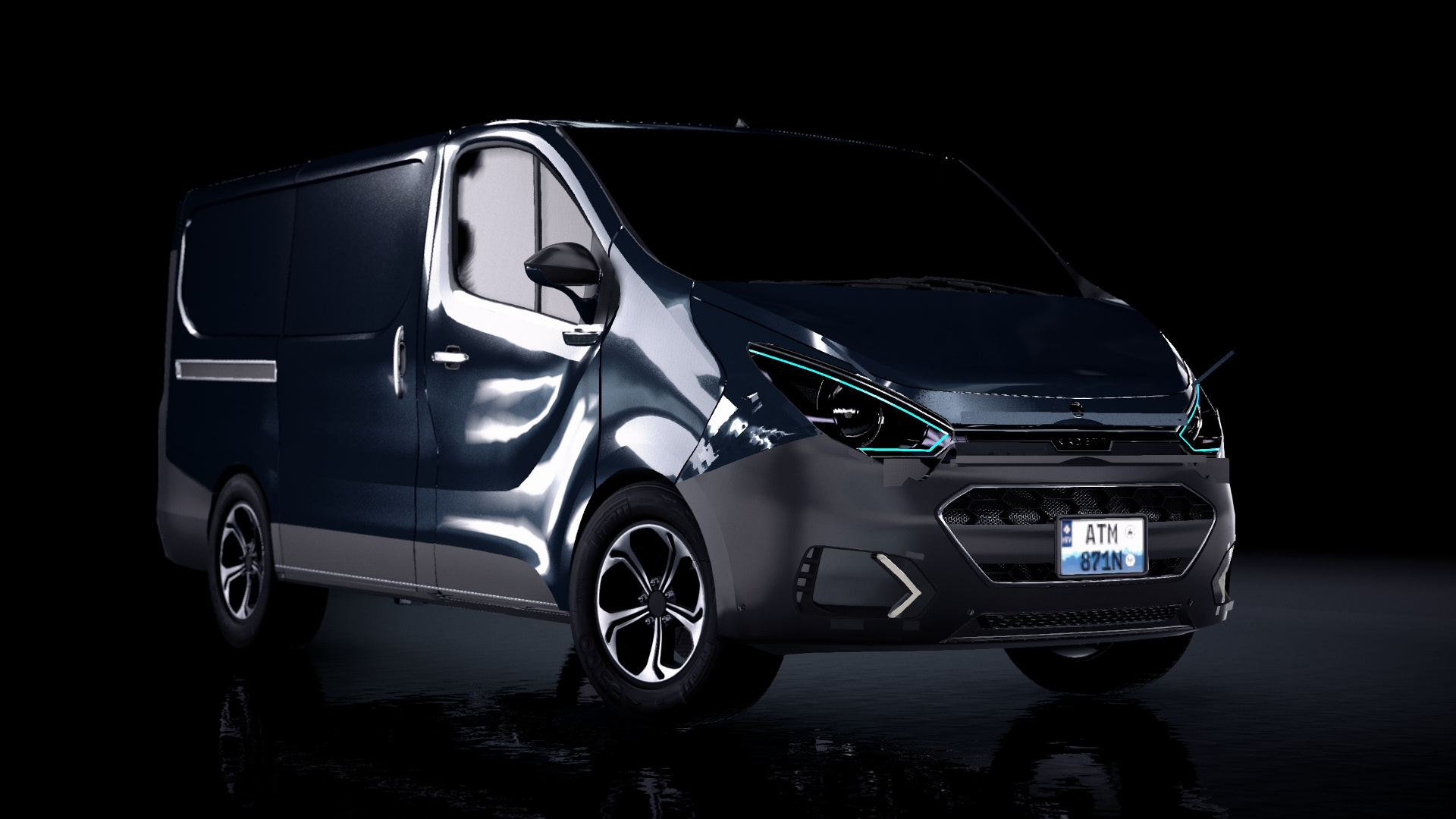
– @Tzuyu_main Project Valentine –
Choe Ji-seok: Daring is what I’d call this, and in that regard it’s perfect. Might be exactly what we’re looking for.
Overall design: When it comes to the van from Project Valentine, the absolutely gorgeous headlights and brilliant taillights immediately stand out as above the rest and there is no way in hell they’re not gonna make it to the final product. The rest of the van continues with the theme of the lights and frankly, in some places, the design suffers from overproduction such as the front bumper. It looks cool but could be toned down and the same goes for the LED strips in the upper grille. They stand out, look cool and weirdly fit in, but might be too much for a panel van.
Heritage: There’s no doubt that this follows the modern Kadett design philosophy and, as is seemingly usual, takes clear influence from the 2020 Beat. Rear lights in particular fall under this, but they do not look close to looking as if they were lifted off the Beat. The KADET2 badging in front is interesting.
Consistency: The shapes of the lights definitely fit together and the angular grille matches the boxy licence plate indent at the rear fairly well, however the indents do stand out as perhaps too boxy, something more matching to the front grille would have been appreciated.
Utility: sportiness and LED lights overdo it For utility, this submission obviously overdoes it with the LEDs and sporty elements. There is a good amount of plastic here and the door handles look fairly utilitarian, but that can’t save it from the sharp and sleek elements of sportiness included here.
Period correctness: 2020? Very much so for the front end but the rear, as mentioned earlier, includes too many major square elements.
General detailing: Cool little features are noticeable here such as the excellent rear fog lights. The fuel flipper flap is placed poorly next to the rear lights and should be bigger.
–

– @Arn38fr Decarlis Design –
Choe Ji-seok: Decarlis have managed a simple and functional design very well, I’m surprised at how well it works.
Overall design: This front end is edgy and every element fits together excellently with a special note going to the excellent headlights. Materials have been used thoughtfully and while there might be some spacing issues at the rear, it’s a very tasteful design that could pass off as a real van.
Heritage: It looks like a Kadett. To be more specific, it looks like a custom take on the basic Kadett design language, which is exactly what every other current Kadett is designed around. The rear light material choice is very appropriate.
Consistency: Compared to the edgy front, the rear does stand out as a little too round. However, this is nothing serious and the van still looks well composed and proportioned, front to rear.
Utility: Definitely. This looks like a proper, modern panel van that is reserved with its use of LEDs, sporty elements and bright colours. The door handles fit the criteria well.
Period correctness: There are LEDs, there are sharp design features so it should excel, but the rather round rear still brings the whole van down.
General detailing: The KADETT badging in the front is small and hard to see at a distance, but the badging overall has been utilized well. There are neat elements that help bring the whole package together.

–

– @Mikonp7 Propeller –
Choe Ji-seok: Another Beat inspired van, I see. Propeller seemed to go beyond just slapping the Beat design on a chunky van however, this one helps its sporty look by actually being more compact.
Overall design: This is very Beat like, but still includes original elements that help it differentiate itself from the former… sort of. The upper grille is a genuine grille and not a black slab of gloss and the taillights, while reminiscent of the Beat, seem more futuristic and angular. Stealing some of the sportiness factor are the weirdly small wheels.
Heritage: It’s pretty much a given that looking like an existing model would make it fit in with the rest of the lineup and obviously that’s the case right here. The taillights continue the current Kadett trend of a monolight at the rear and it helps this submission look unique among other entries. Plastic running along the lower end of the car is also Kadett-like and fits in nicely.
Consistency: Aggressive shapes appear from front to rear and the entire van looks well composed.
Utility: From the cool front hood bumps to the sporty wheels, this entry is most likely the sportiest of all entries and as expected, that doesn’t fare well for the utility aspect. Rear lights could be considered too futuristic for a utility van but the side bumpers sort of balance it out, even if they look outdated.
Period correctness: Both the front and rear lights, as mentioned earlier, not only look good overall but are modern and perhaps even futuristic. The futuristic part also applies to the rear lettering but not the overall body shape, which is round and appears a little old.
General detailing: Like the entry from Spander, the side indent is nice but looks a little messy and could have been integrated in a better way. The front grille would have benefited from being filled with some elements but overall, it’s a nicely furnished van.

–
If you spot a mistake, you have the permission to publicly shame me, but at least notify me about it and I’ll fix it. Part II coming some time within this decade.
16 Likes
— REVIEWS PART II —
Sponsored by I’m sorry
–
– @F17Francesco Raziel Design Studio –
Choe Ji-seok: Bright! No really, why is this colour so bright?
Overall design: The front bumper suffers from a case of fixtures being slapped on there without much cohesion. While it’s going for an aggressive look with the multiple vents, the amount of empty space and lack of any shaping makes it look blander than what it should be. This is a case where using hood scoops for shaping could improve the look of the car. One neat idea are the circular taillights, but them being in a fully square housing and some of the material choices do tamper with the overall design of them. The rear bumper should stick out further.
Heritage: Obviously, the front end design is a modification of the usual Kadett design theme, with both upper grilles being functional and main light units being connected to the lower grille. The badge is additionally placed lower down than usual and overall, this is a good idea.
Consistency: As mentioned earlier, the front bumper design is messy and should use a redesign, but the rather square design motifs run from the front to the rear.
Utility: Plastic runs through the van and with the steel wheels, side amber indicators and marker lights, boxy door handles and large front headlights, this submission definitely looks utilitarian.
Period correctness: With the multiple amber indicators at the rear and front ends, this entry would lead you to believe that it’s from the 2000s. The split headlight design however helps, but again that’s brought down by the, almost 80s-like door handles. They’re utilitarian, yes, but don’t benefit the look of the van much.
General detailing: The lack of a railing for the rear doors is noticeable and does not benefit the look of the van much, but the fuel door is at the correct spot, being behind the front door. The KADETT badging at the front and CONVEY badging at the rear have some spacing issues, but obviously that isn’t anything too important.

–

– @vouge –
Choe Ji-seok: This is a good and even, weirdly classy looking van. Does it look too much like the Beat however? Not sure…
Overall design: Another inspired entry, this one looks good, and that’s about as much text as my brain can squeeze out for this van. Again, it looks good. The look of the Beat has been transported well onto a van and that’s good, and the taillights, which look nice, are more creative than the headlights.
Heritage: Yeah okay the front end of this is a Beat. Sure, the gradient effect with the lights might actually look better than on the original car and the grille is sort of original, but at the end of the day, it looks like a Beat and with Kadetts theme of “Different interpretation of the same basic idea”, this inspiration doesn’t do this van too many favours.
Consistency: While the front is quite curvy and yet still using straight lines, the rear seems a tad too boxy. When it comes to where every element is placed, this van does a good job of keeping it consistent and not having overdetailed areas in one place and underdone areas in the next
Utility: There are relatively few plastic covered panels and as a result, it could pass of more as a passenger van instead. Still, even with the LEDs, it doesn’t look like it’s pretending to be something which it isn’t.
Period correctness: It has LEDs, it has sharp lines, it looks modern.
General detailing: The front KADETT badging is again small, just like the door handles, but those are slight annoyances. A radar system installed on the windshield is a cool idea, if a little weird.

–

– @mart1n2005 –
Choe Ji-seok: Huh, it’s sort of creative. I couldn’t tell you why it feels more creative, but it just does.
Overall design: The design is relatively clean and functions well with few true setbacks. With their gradient effect, the taillights look cool but due to their shape, might seem older than they should. The headlights should be placed further towards the sides of the van and be less wide towards the middle, the center black plastic grille appears too tall and could do without the chrome surrounding it.
Heritage: Some inspiration has been taken from current Kadett models but overall, it sticks to the formula and doesn’t really huge strides to stand out, which, for a van, might not be a bad thing. The taillights having a gradient design is a plus.
Consistency: One mistake here shared by multiple other entries is the design cue of having sharp angles at the front end and not continuing the motif to the rear end. This causes the two ends to not look joined and obviously hampers with the overall look of the van.
Utility: A split rear door would have been preferred but the bumpers are plastic and there are railings on both sides. A rear window wiper is an odd addition but not a bad one. Making it appear strangely off-road ready are the fat tires and small wheels.
Period correctness: The shape of the sidebumpers is modern enough. LEDs are used nicely and the gradient effect in the taillights helps with making it look appropriate for 2020.
General detailing: It has a very tiny exhaust. Other than that, there are some nifty details, like the rear hatch hinges.
–

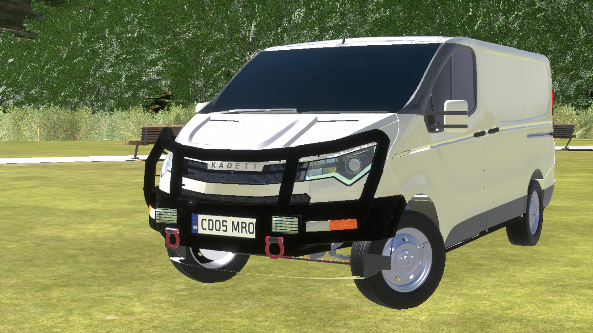
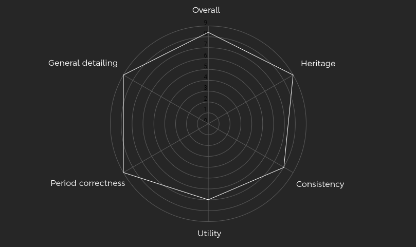
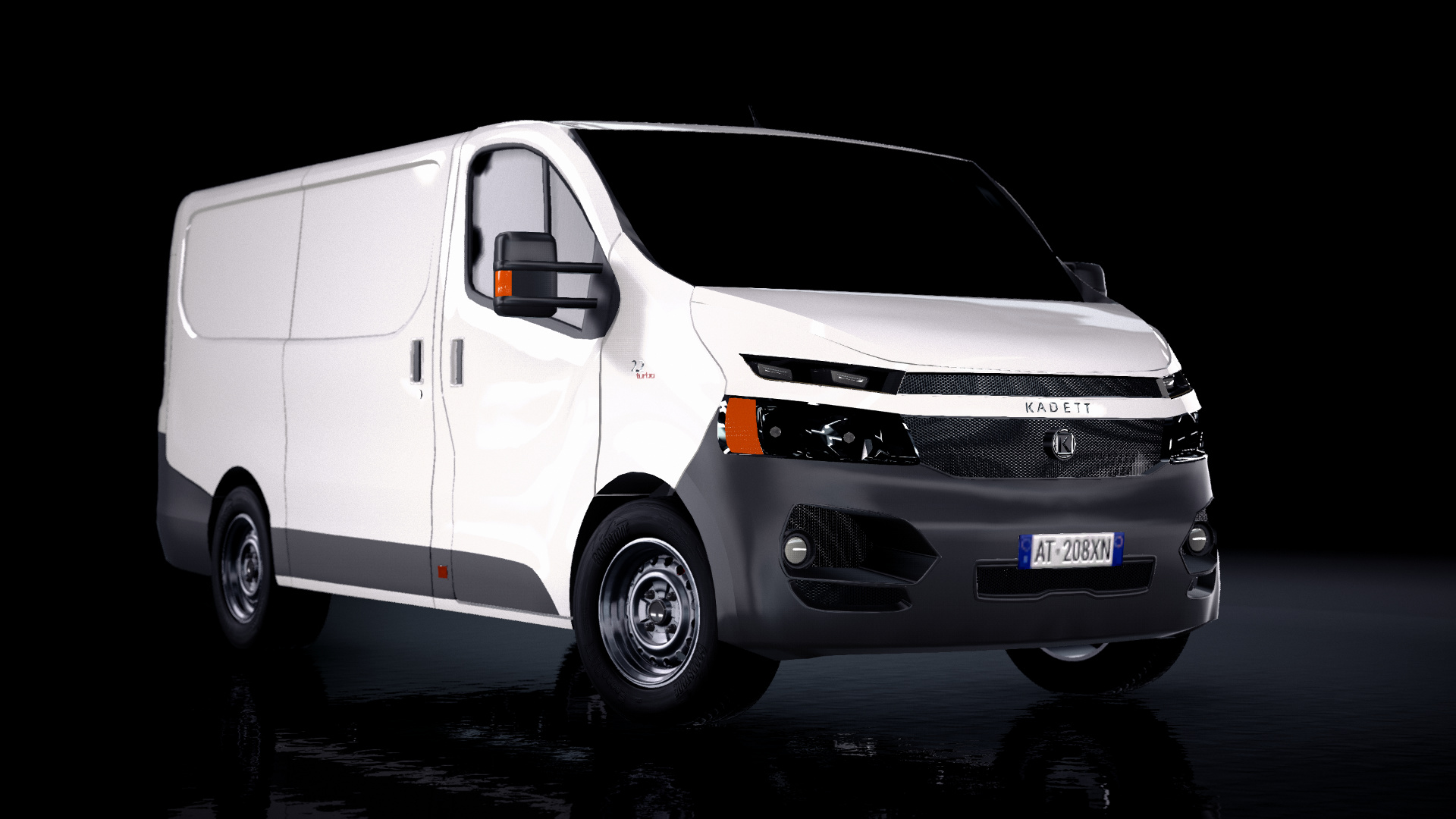
– @That-S-cop Marksman –
Choe Ji-seok: Now this looks familiar… Oh, because it looks like a Beat! Still looks good however…
Overall design: This is a great looking van with some nice elements, such as the fantastic taillights. Seriously, they look great and have been done nicely. The black A-pillar looks nice but looks a little sloppy, much like the front bumper. This comes from the choice of materials and fixtures used here…
Heritage: This van from Marksman takes the usual Kadett design language and makes an evolution to something differe-… Wait, that was meant for something else… Oh, here it is… It’s a Beat what the hell did you expect. Granted, it obviously isn’t a 1 to 1 copy and takes some of its own liberties, but the main design aspects are here. That includes the weakest part of the Beat, which would be the front side vents.
Consistency: Sharp angles go from front to rear… Mostly… and it looks well composed. There isn’t a panel that looks underdone compared to the rest and that is obviously a good thing.
Utility: Definitely. It might be too utilitarian however, with the four exposed tow hooks and such and it ends up looking more like a conversion of a base van. Cannot fault it too much however, since it achieves its goal of being an utility van after all.
Period correctness: The side indent, aside from being well done and looking great, adds a flavour of modern-retroism to the design. That’s generally a good thing. With the modern looking head- and taillights, the whole van looks modern and fits in well.
General detailing: The rear badging is oddly big… Other than that, the side railing is well executed, the rear bumper is fantastic and the fuel door is at the correct place, even if the keyhole on it is outdated. There are also other places with good attention to details, like the tow hitch cutout.

–

– @yangx2 Honghu Automotive Corporation (Honghu, Huangdou & Jinhe) –
Choe Ji-seok: Striking! Distinctive! Different! A bit too much?
Overall design: As is pretty much expected, this van from Honghu features a rather striking design with a rather, ahem big grille and stylish front lights. It’s an odd mix of utility and elegance that actually works well, which is a good surprise. The central rear exhaust pipe is, to say the least, stu- weird
Heritage: Mixing the design languages of Chinas HeckHu and Koreas Kadett, it looks like an evolution of both design languages and that’s either a good or bad thing, whichever way you take it. The black plastic on top- and real grille on bottom design has been retained, with another grille pasted above the normal two. It doesn’t quite look like a Kadett at first glance, but definitely resembles one once you take a closer look.
Consistency: Again, straight lines and sharp turns run across the van and it all looks like it belongs together. The front might be begging for some plastic around the lower edge when compared to the rear end but that’s a small niggle.
Utility: Despite the garish front end, it manages to stay relatively utilitarian, in no doubt thanks to the exposed rear hinges and square bumper elements.
Period correctness: A good use of LEDs, a sharp overall design and angular shaping at the rear makes it look good for 2020. The exposed hinges however, while good for looking utilitarian, do age the look slightly.
General detailing: Some of the cool elements here include the front camera, the grooves featured on the roof and the rear badging.

–

– @ST1Letho Lethos House of Letho –
Choe Ji-seok: Wow, this looks more like a concept than anything. It ain’t bad, just a little odd.
Overall design: Now this looks striking, but definitely in a different sense than the Honghu. The most distinctive feature is the two-tone side which, while interesting and perhaps money-saving, could have probably been executed better. The way it “takes a step down from the front wheel arch to the rear arch” looks odd but not bad. What is a good idea is the lightbar on the back, or at least in terms of design but just below it, the licence plate feels stuck on without an indent for it.
Heritage: The design follows the Kadett formula but takes some liberties, such as having an odd indented are between the two grilles. A lightbar at the rear adds to the heritage feeling but what doesn’t is the seeming lack of any Kadett badging throughout the van. Was this a deliberate attempt to hide the nauseating brand of origin, or was it a simple styling choice? Who knows.
Consistency: Yes, this looks more like a concept car from front to rear. There are three lines on the front bumper which don’t get continued anywhere and as a result, look out of place.
Utility: Yeaaaaaa noooooo… The glass roof would make it hard to carry anything on it and, like with the ambitious LED heavy front- and rear lights, would most likely be relatively expensive to repair. With the high suspension and fat tires, it also looks more like an off-roader than any of the other vans, but honestly, that’s not really a problem.
Period correctness: Is it too 2020? Nah, probably not. Aside from some particular elements, like the aforementioned lines on the bumper and the mirrors, it looks like a van that’s modern.
General detailing: It has some small door handles. Otherwise, it’s the usual fare of dots on bumpers to act as parking sensors and… some other stuff, I guess. Still, the lack of badging is weird.

–
– @Slyo_vom_Pluto Wagenmacher –
Choe Ji-seok: And for the final one, we return to something more conventional. Not only does it look like a more conventional van, it looks like a conventional Kadett.
Overall design: Right off the bat, the squished headlights harm the design, moving them further off to the sides would improve it a lot. Overall, it’s a nice blend of conventionalism and good ideas. The front LEDs being blue instead of white is a cool touch and the taillights have been executed well but, as with the front lights, should be further off to the sides.
Heritage: Yep, this is a Kadett alright. While it might look like an Avatrek from the front, it has enough of its own identity to stand out. The rear lights and badging across the car stick to the formula and don’t sway anywhere else.
Consistency: As was the problem with a van from earlier, the different vents included in the bumper here leave too much space between them without any shaping between them and as such, it ends up looking more barren than it should.
Utility: There are metallic elements throughout the design, perhaps too much of it. Those elements don’t hide the utilitarian heritage of it though, and it doesn’t really harm the final product.
Period correctness: With the sharp angles and cool lights, it looks like it belongs in 2020. Not much more to say.
General detailing: The badges have been executed perfectly and the metallic strips on the front look nicely done. The fuel door is in the correct place, thankfully.

–
— THE FINALE —

3rd of August, 20XX, not in Korea.
Choe Ji-seok and his assistant are preparing for a flight to Germany, ready to meet with the heads at Kadett of Europe. Every prototype of the Convey has been transported to the headquarters there, with a focus group coming in to see every van. After their comments and approvals are noted, five finalists will be chosen.
A selection of comments from the group.
– @Boiled_Steak Aria Design –
…looks like it would get the job done…
– @Darkshade-AP_Autos Kaishen Design Co. –
…doesn’t look bad but frankly, doesn’t look too great either…
– @HybridTronny Atera Design Studio –
…It’s familiar, I’d feel homely in it…
– @Maxbombe Spander Design –
…funky!..
– @Tzuyu_main Project Valentine –
…this is cool, but would they get away with it on a panel van though?..
– @Arn38fr Decarlis Design –
…this is also homely, even more so than the Atera…
– @Mikonp7 Propeller –
… it’s compact, sporty and has some cool lights, must mean it’s perfect amirite…
– @F17Francesco Raziel Design Studio –
…interesting idea, not much more…
– @vouge –
…it’s good, but doesn’t try to be anything different to be honest…
– @mart1n2005 –
_…again, some good idea but the execution might be a bit lacking…
– @That-S-cop Marksman –
…is this a conversion? Oh wait, nevermind…
– @yangx2 Honghu –
…China? … CHINA??…
– @ST1Letho House of Letho –
…I like its ambitiousness…
– @Slyo_vom_Pluto Wagenmacher –
…it looks like it would fit in snugly…
–
After a whole 30 minutes of reviewing each car, and after just 5 days of reviewing the results, the finalists were chosen.
– 5th place @Mikonp7 –
With its compact dimensions and neat design ideas, this one gets a deserved place among the finalists.
–
– 4th place @yangx2 –
It’s striking, it’s different, it’s everything you’d except from Honghu, maybe except the memes.
–
– 3rd place @Maxbombe –
It isn’t the most striking or the most utilitarian, instead it fits in nicely between the two creating a good blend of both.
–
– 2nd place @Tzuyu_main –
Most definitely the most futuristic and wacky of the selection here, this one from Project Valentine was in a seriously tight race with the 1st place finisher. No seriously, it was tight.
–
– 1st place @That-S-cop –

Mixing utilitarian looks, modern features and a fantastic design overall, the submission from Marksman deserves this win and we look forward to seeing what you have on offer next.
–
Thank you to everyone for entering CSC30! I must apologize for the really late conclusion, real life can just jump on you when you’re least expecting it. Still, thanks to all of you. If you spot any mistakes here or would like something explained further, let me know.
20 Likes