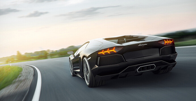
Photo-editing your automation car tutorial. (Update: detail)

[quote=“strop”]The wheel part is the pain in the ass part… if you’re not editing the car or the background any further than that.

If you are, however, than the wheel part is probably the easiest part of the entire process. (Shameless plug because sheer amount of effort required to apply CF skin plus lacquer reflection effect). Aside from the difficulty of not always wanting to look directly at the car in your graphics which skews the perspective in off-center shots, the Automation models are very handy for providing a 3d reference with which you can do actually quite a lot of things, including painting new things entirely if you so wished.[/quote]

holy cow O_O i’ve never seen that

if i no one mentioned that it was from in game and someone told me it was an actual irl concept car i would actually believe it.
it’s THAT good O_O.

but then again. from someone that truly never edited an actual photo/image with photoshop. even the tools are confusing, even with paint .net or gimp some tools are just purely frustrating.

editing a wheel is a somewhat of a big jump/big challenge for a total newbie.
Don’t worry, just throw attempts at the wall, see what sticks. It’s how I learned photoshops :slight_smile:

Another tip i would suggest is: If you want to place your car on a road or match the wheels, add transparency to the Automation Window via a Autohotkey script: poojanblog.com/blog/2008/08/autohotkey-transparency-script/

This way you can align your the car much easier:

Base image:

Aligning the car in automation:


Note: I’ve rotated the base image so the car is horizontally flat and i can align it better.

Result (after some additional adjustments):

[quote=“asdren”]Another tip i would suggest is: If you want to place your car on a road or match the wheels, add transparency to the Automation Window via a Autohotkey script: poojanblog.com/blog/2008/08/autohotkey-transparency-script/
This way you can align your the car much easier:[/quote]

I love you man!

[quote=“squidhead”]

This way you can align your the car much easier:

I love you man![/quote]

I just tried this and it works, IT WOOOORKS!
So happy! Thanks for sharing.

Updated with Asdren technique and added a bit of my own.

Anybody interested in in-depth tutorial on how to do this?

Click for huuuuge picture

I am a supernoob in photoshop. How do you edit the perspective of a layer?

select the layer, click ctrl+t on it, and then right click on it to chose the ways you wish to change the perspective. You’re looking at either “perspective” or “skew” most likely

Updated with some detailing tutorial.

Squidhead is a fucking wizard.

A photoshop tutorial!!.. didn’t see it before :confused: .
All I can say is thanks, in all of this time I have not been able to do it… :blush:

I wish to add a few ‘tips’, or different techniques/alternatives to those that have been pointed out.

Step 6. Shadows…, you also can do them through <Drop Shadow> -Layer Styles- with a duplicated layer of the car (that you’ll put under the main car layer).
After setting up the angle, distance, etc, of the shadow, merge the layer <Merge Linked> with a 2nd (an empty) one, you’ll get a new one without effects but with the shadow and the car.
Now you can work on the shadows and delete leftover areas, etc. You can add <Feather> to the selection while deleting a given area to get a shadow gradient.
In this way getting a basic shadow is quicker than drawing it from scratch.

Detailing - Step 6. Brightness lines. I think <Smudge> is fine while there’s a minimal gradient deviation, i.e. almost a plain color around the bright area, if not…
Anyway, if you have to re-draw a straight line (from a little area that you can clone) the <Clone Stamp> is your best and quicker friend.

I’ll be following the thread closely.

I actually have a bit of a problem even getting started, namely, ever since the most recent sort of version of the game, the UI is saved along with the picture, and the background turns white instead of transparent when I have the Buildings toggled off. And I’m sure if this is a glitch or a universal issue. :\

That is why you need to take the picture from the gearbox menu with the graphs hidden. And that’s also why you should turn FXAA on, or off if you wish to leave background transparent…

added to first post

Really great guide. We all simply must appreciate all your hard work!

[size=85](too bad I don’t have Photoshop…)[/size]

EDIT…Do you mind me asking how long has it taken you to get this good at photoshopping?

Ehm… well the first pictures in my thread are actually the first tries. And I have uploaded pretty much all of the ones I’ve made, so I guess it’s “that many pictures” :smiley:
A month is probably enough if you put enough effort into it.

I’ve been looking for some screenshots with english interface (I got it in spanish so not really helpful) to add another option that might be useful in some scenarios, that would be Replacing Color.
I’m gonna use it to get the stats background in black but It can be applied in any place with anything (you can replace the color in the whole pic, a layer, or a selection).

We start with a piece of the common stat screenshot.

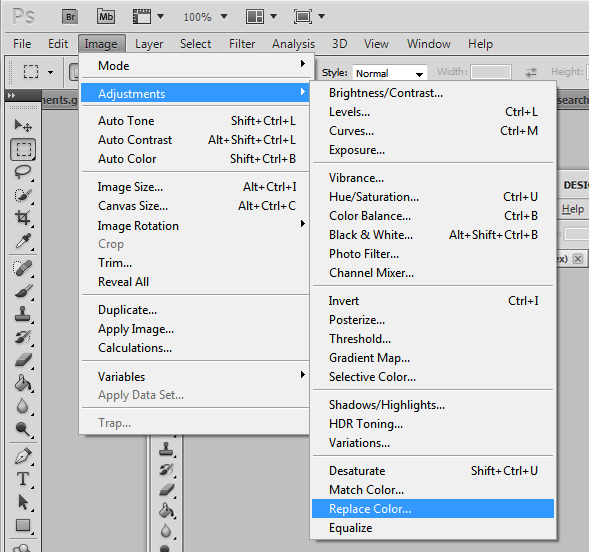
Now we head to the main menu; *Image *> Adjustements > Replace Color (as you can see in the next pic).

This will open the Replace Color configuration window.

Replacing Color (RC).
Just a few things:
Trough the dropper we will select the first (and main) color to replace. The dropper with a plus (plus dropper?) will allow us to add another color, or more.
The Fuzziness would be like the color deviation allowed regarding the color/s selected, so take care selecting many colors or setting high fuzziness values, you know, a given color is ‘a balance’ of basic colors.

Ok, going back to our pic we can see that it has two colors in strips. For this example I advise a Fuzziness value of 25.
Select one of them (through the dropper and clicking on your main pic). Then the little pic on the RC window will change showing in white the area affected.

The best way to see how wide is the area affected (in your main pic) would be setting the Lightness to -100.

Let’s go for the other color. We are going to add another color but first, click on the ‘plus dropper’ icon, and click on the other strip in the main pic.
Once again the little pic on the RC window will change in a whiter version,


but we can see that there still are some black areas in the left border.

Now we can choose one of two ways, clicking again with the ‘plus dropper’ in a black area (on the main pic) or set a higher Fuzziness value (like 75).
Sometimes one way is better than other, so try it.

Looks ok, click OK and we are done.

Tada!!

Great stuff. Awesome post Squidhead, a credit to the community.

Alright! With some basic PS abilities, then, it shouldn’t be too bad. Thanks for making this